

Designer at https://xitter.cf/t.co/XNWSu8qpuX. Making good ideas impossible to ignore.
Joined December 2025
- Tweets2.1K
- Following321
- Followers1.5K
- Likes9.9K




Dottaa retweeted

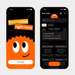
Your app can be amazing.
But if the first 30 seconds suck, most people will never find out.
Here’s the onboarding we designed for scheduler app 👀


Dottaa retweeted

Abode...
A real estate mobile app design
I'm open to design gigs or collaborations, Send a DM📤


Dottaa retweeted
I design cool mobile apps, then bring them to life with interactions.
Profile UI Interaction. ⚡️


Dottaa retweeted
B is the stronger of the two options, but two things hold it back.
First, the signpost sits in the sky, yet its base casts a shadow that says it’s planted in the ground making the scene contradict itself.
Second, the five posts-cards repeat the five signs. Every city is shown twice, and the repetition fills the whitespace the signpost needs.
Together, they feel like two directions forced into one screen.
To redesign it, i recreated the signpost from a low angle, looking slightly upward. That keeps the sky as the background, because it’s actually what you see looking up, and it resolves the contradiction. Each city also carries its country flag for easy identification, and without the posts-cards, the signpost had the whitespace it needed.
While exploring, I ended up with two layouts. The left frames the sky in a card while the right lets it run full width behind a bottom sheet.


Dottaa retweeted

Icon animation with @figma motion
What do you think?
Dottaa retweeted
Designing and then making it actually work is the best part of this era.💫
Another cool mobile app interaction..


Dottaa retweeted
Custom illustrations make a product feel less like software and more like a place someone designed for you. It’s a signal that a designer made deliberate choices for this product and its users.
That’s the kind of designer I am.


As a full-time product designer, one skill I enjoy combining with design is marketing. Writing UI copy is where it shows most, because it's about making you see why the thing I've created matters to you.
As a freelancer, it's easy to one-shot the copy with AI. In-house, I get to work through it with the marketing team, and being aligned on a vision makes feedback easier to accept, even when it's negative.
For this card, I didn't want a title like "subscribe to our newsletter," which is easy to dismiss. The goal is still a signup, but "Get the good stuff, minus the fluff" promises less noise in your inbox without sounding generic. The button speaks in your voice, with "Count me in" instead of "Subscribe." And "No spam, just value" reaffirms that promise right under the button.
Marketing says it works, but that's approval from inside the room. If you saw this on your screen, would the headline make you read the rest, and would the last line make you trust the button?


