

A kickass guide to making literature events accessible to disabled people Founded by @EverDundas & @Julie_Farrell_ Bookseller 2022 Top 150
- Tweets809
- Following816
- Followers962
- Likes544






ALT ID: Life Writing: The Possibilities of Place. An Online Creative Writing Masterclass with Nina Mingya Powles. Thurs 2 November, 10am UK time. Tickets £15, Free Spaces Available.


ALT The Illustrated Freelancer's Guide 3rd edition


ALT At the front of Edinburgh International Book Festival, with a big yellow sign above the doors leading into the venue. Photo credit: Shutterstock


ALT At the front of Edinburgh International Book Festival, with a big yellow sign above the doors leading into the venue. Photo credit: Shutterstock


ALT Coral background with a swathe of white at the bottom which is partially obscured by a black ink smudge lower right and a black ink splat lower left. Text reads: “I feel nervous going to events because I know there are always gaps in access. That can be an emotional burden for disabled people, and it will be discouraging people from going to events.” - Maud Rowell


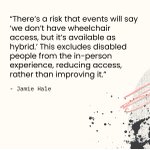
ALT White background with a pixelated black ink smudge lower right with a coral line squiggle and black ink splats. Text reads: “There’s a risk that events will say ‘we don’t have wheelchair access, but it’s available as hybrid.’ This excludes disabled people from the in-person experience, reducing access, rather than improving it.” - Jamie Hale


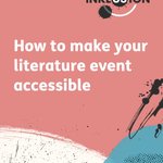
ALT The cover of the Inklusion Guide: coral, with swathes of white, blue, and yellow across the bottom with Ink splats. The logo is top right: ‘Inklusion’ in black letters apart from ‘us’ in white in the middle with a black ink splat in the background. Two white semi-circles frame the word above and below with two ink splats, one bottom left, the other top right. The heading is in large white letters: ‘How to make your literature events accessible.’ Tope left is a white rounded-corners square with an illustration of a book and ‘Easy Read’ next to it.

ALT The greyscale cover of the Inklusion Guide with the title in large bold black letter and the subheading below in smaller lettering: ‘A kickass guide to making literature events accessible for disabled people.’ Below that it says in bold: Large print edition The greyscale logo is top right: ‘Inklusion’ in black letters apart from ‘us’ in white in the middle with a black ink splat in the background. Two grey semi-circles frame the word above and below with two ink splats, one bottom left, the other top right.

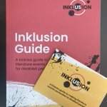
ALT The spiralbound braille copy of the Inklusion Guide on a desk.

ALT The braille Inklusion Guide open on a desk with a plant and various colourful stones in the background.
