

Kris Holmes and Charles Bigelow
Joined June 2014
- Tweets252
- Following326
- Followers649
- Likes636




The Font Wars Part 2 is at: computer.org/csdl/magazine/a……
(Part 1 is at: computer.org/csdl/magazine/a…… )
(Image courtesy of RIT Cary Collection)


"Typeface features and legibility research", from Vision Research authors.elsevier.com/a/1a6q-…


Kris Holmes talks with Debbie Millman - Design Observer Podcast: designobserver.com/feature/k…

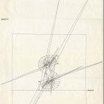
Does anybody recognize this or something like it (maybe an R), and where it came from? Character outline with circular arcs and radii.

Many thanks to Monotype team for launching newly expanded and updated Lucida Grande (4 weights/2 styles) & Lucida Grande Mono (2 weights/2 styles) in W1G sets with special offers:
linotype.com/5785437/lucida-…
linotype.com/5747013/lucida-…

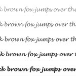
Exhilarated by Monotype’s release of new Lucida Handwriting fonts, reimagined, reweighted, and recrafted, by the Incredible Kris Holmes.

Lucida Fonts retweeted

The Cybersecurity 202: Security experts irked U.S. prosecutors used anti-hacking law to nab Julian Assange wapo.st/2KsBqYX
It's Pi Day! 2270 years ago, Archimedes calculated pi by approximating the circumference of a circle with polygons, as digital font technology today approximates curves with polygons and pixels. nytimes.com/2019/03/14/scien…
Lucida Fonts retweeted

Listening to Kris Holmes (from @LucidaFonts) talk to @debbiemillman about the Ikarus type development system is alone worth the cost of admission to the @typedirectors Type Drives Culture event.
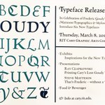
Typography at Cary Graphic Arts Collection RIT: Hermann Zapf, William Morris Kelmscott Press, Fred Goudy, cool student-built aluminum hand press; Hebrew wood type - tug.org/TUGboat/tb39-3/tb123…
Interview with Kris Holmes about her life in type design, with illustrations: tug.org/interviews/holmes.pd…
Good article about dyslexia researchers Sally and Bennett Shaywitz:
nytimes.com/2018/09/21/healt…
New scientific study and comparison - "Fonts Designed for Macular Degeneration: Impact on Reading" iovs.arvojournals.org/articl…

Lucida Fonts retweeted

I am somewhat impressed by how faithfully the makers of this mosaic in Capbreton 🇫🇷 managed to recreate the handwriting style of @LucidaFonts using tiles. The self-made style below is cute – and interesting, too: Why does ‘d’ have a lower x-height than all the other letters?

Amazing Tales: Fonts tell stories: nytimes.com/2018/04/01/busin…
