

Ul/UX Designer Helping Startups Launch Intuitive, Scalable Products || Ex- KAP, TNA, Metavibes
Joined November 2023
- Tweets487
- Following423
- Followers396
- Likes111K






Pinned Tweet
On Day 2 of my #30DaysFigma challenge, I took on the task of redesigning the hero section of @paj_cash. The first frame is the original design, while the second (and others) are my redesigned version.


Lately, I have been exploring how dashboards can feel less overwhelming and more like a space you actually want to use.
This concept is a home monitoring dashboard, where everything you need to know sits quietly in one place.

Day 30 of my #30DaysFigma challenge
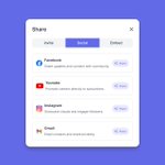
I ended the challenge with something small but often overlooked a share menu.
It’s one of those screens people only notice when it’s bad. If the options feel vague, users hesitate. And If it’s cluttered, they give up.

Here, I try to keep it straightforward, with clear labels, small cues for context, and just enough spacing so it feels intentional. The aim was to make the decision feel effortless.
Day 29 of my #30DaysFigma challenge
Not every screen says “thank you for your purchase.”
Sometimes, things don’t go through. I wanted this screen to acknowledge that clearly without causing panic.

Day 28 of my #30DaysFigma challenge
This screen comes in after the purchase when the order’s placed and the waiting begins.
The delivery stages are broken down with timestamps, giving the user a sense of movement.


Day 27 of my #30DaysFigma challenge
After all the clicks, filters, and decisions, this is the moment users get to pause. The order’s placed. No need to double check or second guess just a quiet confirmation that everything’s gone through.

Day 27 of my #30DaysFigma challenge
After all the clicks, filters, and decisions, this is the moment users get to pause. The order’s placed. No need to double check or second guess just a quiet confirmation that everything’s gone through.
Day 26 of my #30DaysFigma challenge
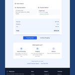
The final checkpoint in the review screen.
After all the browsing, filtering, choosing, and confirming, this is where it all comes together. I designed this screen to feel like a quiet pause before the finish line just one green button away

Day 26 of my #30DaysFigma challenge
The final checkpoint in the review screen.
After all the browsing, filtering, choosing, and confirming, this is where it all comes together. I designed this screen to feel like a quiet pause before the finish line just one green button away
Day 25 of my #30DaysFigma challenge
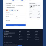
Today I worked on the payment step of the FASCLEV flow. It’s one of those moments in the journey where everything slows down a bit. The user has made their choices, filled in their info, and now they are about to commit.

from owning that pair of sneakers 😄
Also, the shipping address is clearly shown, while the payment method is partially hidden for privacy but still visible enough for users to recognize.
Day 25 of my #30DaysFigma challenge
Today I worked on the payment step of the FASCLEV flow. It’s one of those moments in the journey where everything slows down a bit. The user has made their choices, filled in their info, and now they are about to commit.
Day 24 of my #30DaysFigma challenge
After shaping the browsing and product detail pages, I moved into the checkout flow specifically the Shipping Info step.
At this point, clarity becomes everything. Users are ready to commit, so the design needs to stay out of their way.

This screen has to feel calm, trustworthy, and complete.
I laid things out simply, payment methods upfront, with credit/debit cards, PayPal, and pay-on-delivery options visible at a glance. The form is short, just enough to get the job done without introducing friction.
Day 24 of my #30DaysFigma challenge
After shaping the browsing and product detail pages, I moved into the checkout flow specifically the Shipping Info step.
At this point, clarity becomes everything. Users are ready to commit, so the design needs to stay out of their way.
Day 23 of my #30DaysFigma challenge
Today I worked on the shopping cart experience. The goal was to help users stay focused without interrupting their flow.

Day 23 of my #30DaysFigma challenge
Today I worked on the shopping cart experience. The goal was to help users stay focused without interrupting their flow.
Day 22 of my #30DaysFigma challenge
I worked on the product detail page today. This is where most users decide whether to buy or not, so it had to feel straightforward and reassuring.
