

ᴘʀᴏᴅᴜᴄᴛ ᴅᴇꜱɪɢɴ & ꜱᴛʀᴀᴛᴇɢʏ ꜱᴛᴜᴅɪᴏ. ᴘʟᴀʏɪɴɢ ᴡɪᴛʜ ᴀɪ 🤖 @mize_app now live: https://teapaw.org/t.co/5oWLXe86ea Anti-slop design systems for your agents- see website
Joined March 2026
- Tweets1.6K
- Following1.1K
- Followers667
- Likes314


dont underestimate the power of minimalism ♥︎

Less to carry, lighter to move. Everything you keep is a little weight you take with you.
MIZE helps you want less. Free to download: mindfull.studio/mize

1
18
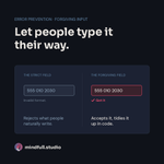
Let people type it their way.
"555 010 2030", "555-010-2030", "(555) 0102030". Same number. A form that rejects two of them is making people do the computer's job.
Try it: accept spaces, dashes and brackets, then tidy the value in code.
Builders: which field still fights you?

1
29
Undo beats "Are you sure?"
People click through confirm dialogs on autopilot, so the warning rarely saves anyone.
Try it: let the action happen, then show "Deleted · Undo" for a few seconds. Save the dialog for what you can't reverse.
Builders: where would undo help most?

4
85
this actually seems useful 🔥

The AI industry has a benchmarking problem.
We're letting random people on the internet decide which models are best
even for capabilities like design...
So we built something different.
Introducing The Frontier Design Benchmark from @contralabs
contralabs.com/frontierdesig…
1
51
The bias is: the sunk cost effect. (07)
The more we've already put into something, the harder it is to walk away, even when we should.
Sitting through a dull movie because you already bought the ticket. The ticket's gone either way.
In a product, it cuts both ways. Make it easy to quit a long flow or cancel a plan, with no guilt screen. And when your own feature isn't working, the time already spent on it is not a reason to keep it.
What are you keeping only because you already built it?

2
51
The bias is: framing. (06)
The same fact feels different depending on how it's worded.
"Mostly sunny" and "a chance of rain" can describe the same sky. One gets you outside, the other makes you pack a coat.
In a product, button labels and error messages are frames. "Keep my account" lands very differently from "Cancel deletion." Word it the way the person thinks about it, not the way the database does.
Which label in your product is written for the system, not the person?

1
4
67
Your icon is 20px. The tap area doesn't have to be.
Fitts's law: the smaller the target, the harder it is to hit.
Try it: pad small buttons to 44×44pt on iOS or 48×48dp on Android. The icon stays small, thumbs stop missing.
Designers: what's the tiniest button you still ship?

51
The bias is: confirmation bias. (05)
We notice what agrees with us and slide past what doesn't.
Think a café is great and you'll remember the good coffee, not the long wait.
In a product, teams do this with feedback. They quote the happy comments and skim the confused ones. Read the confused ones first. They're where the design is breaking.
Which piece of feedback have you been quietly ignoring?

1
1
66
The bias is: loss aversion. (04)
Losing something stings more than gaining the same thing feels good.
Losing your umbrella ruins the day. Finding one on a bench barely registers.
In a product, a real loss deserves a real warning: "You'll lose this draft" before someone closes the tab. But never invent a loss just to pressure a click.
Where does your product let people lose work without a word?

1
41
A button that does nothing for a second feels broken.
Visibility of system status: people should always know what's happening.
Try it: when someone taps Save, change that button. "Saving…", then "Saved". Silence makes people tap twice.
Builders: where does your app go quiet?

3
2
76
The bias is: default bias. (03)
People tend to leave the pre-selected option as it is.
The copier that arrives set to color is why the paper tray is always empty. Nobody chose that. It just came that way.
In a product, a pre-checked "email me tips" box is a design choice, not a neutral start. Default to what you'd be comfortable leaving on.
Which pre-checked box wouldn't survive that test?

1
3
66
The bias is: banner blindness. (02)
If it looks like an ad, people skip it, even when the message matters.
A boarding sign styled like a promo gets the same glance as a perfume poster. People walk past it.
In a product, a colored "New: export" strip gets ignored like an ad. Put key messages in the page flow, in the same type as the rest.
Where are you hiding a key message in a promo-shaped box?

1
55
Your interface shouldn't be a memory test.
Recognition over recall: picking from what's on screen is easier than remembering it.
Try this: when someone returns to a search, form or filter, show what they used last time.
Designers: where does your product still quiz people?

1
3
72
Starting a new daily series: The bias is.
One cognitive bias a day. What it is, where you've already met it, and how it shows up in the products we design.
The bias is: anchoring. (01)
Whatever we see first becomes the yardstick for everything after it.
Try on a heavy winter coat first and every jacket after it feels light. The jackets didn't change. The starting point did.
In a product, the first screen sets that yardstick. If it's packed, every screen after it feels like work. Open with the simplest version, and let people add detail when they're ready.
What's the first thing people see in your product?

3
1
172
600 followers. Thank you.
October 10: 61
October 24: 113
November 10: 503
Today: 600
No ads, no threads, no viral post. Almost all of it came from one habit: replying to builders who post "what are you building?" and asking about their thing.
Small studio, building MIZE - Minimalism Coach app, a new social mapping app (coming soon*) and Anti-Slop design kits: mindfull.studio
So, what are you building?

5
4
170

AI-made screens look generic for a boring reason: the agent was never shown what your app looks like.
Before an agent touches our UI, it gets the design system: tokens, spacing, real components, and a list of what not to do.
Designers: what's the first rule you'd give it?

Just hit 400 followers 🎉
Not huge, but almost every one of you came from a real conversation: builders sharing what they're making and me sharing what I'm making.
Thanks for following along. More on building apps with AI agents, product design and MIZE coming.
What are you building right now?

