

Product designer. I treat AI as a studio, not a slot machine. Building VISUAL OS — an open system of 170+ visual styles ↓ [email protected]
Between design & AI
Joined August 2025
- Tweets5.3K
- Following771
- Followers10.1K
- Likes12.2K


VISUAL OS 099
Red paper, fat black marker, round happy people.
SEED SWAP — two gardeners passing one giant bean.
PATCH PARTY — mending one huge shirt together.
SLOW SPIN — two dancers circling a record.
SOUP LOOP — four neighbors, one pot, four bowls.
Prompt below ↓
🤖 Made with AI


Prompt ↓
Community event poster, [RATIO], full bleed. Two inks only: warm vermilion red (#E84125) and near-black.
Scene: [PEOPLE + THE ONE THING THEY SHARE]. Characters drawn in broad, blunt, wobbly black marker: big irregular round heads, dot eyes, small ring nose, wide smile, mitten hands. Their bodies stay the same red as the ground, outlined in black. Flat, no shading.
Dense black dots or broken checks on one or two clothing areas only. Lots of calm red space.
Bold black grotesk headline "[HEADLINE]", a short black italic serif line "[SUBLINE]", and a small sans-serif info line "[DATE / TIME / PLACE]", with a thin rule or two. No other text.
No white fills, gradients, 3D or logos.

Vigo Zhao retweeted

《999 个小技巧,让你 Vibe 的产品更有质感》
✨ 002 少数人才知道的级联菜单小技巧:添加安全区域延时。
什么是三角区?
鼠标从父菜单斜着移向子菜单时,难免擦过下面几行。普通菜单一碰就切换,子菜单就“跑丢”了。
原理很简单:以鼠标上一刻的位置为顶点,连到子菜单靠近一侧的上下两个角,围成一个三角形。鼠标在三角形里,说明它正朝子菜单走,路过的行一律忽略;离开三角形,或者停留超过 1.2 秒,才切换到新的一行。
另外还有两个延时:悬停 220ms 后才打开子菜单;鼠标离开菜单 360ms 后才关闭。
Prompt 如下,可以直接抄 ⬇️
Define a cascading (nested) menu component that keeps its submenus steady: a safe zone plus three delays, so submenus open on purpose, survive diagonal moves toward them, and do not vanish on a brief slip out of the menu. If the project already has a menu or dropdown component, build this into its existing submenu logic and keep its API, keyboard support and accessibility as they are. Otherwise create one reusable CascadeMenu:
Props: an anchor (the trigger button that opens it on click) and a tree of items, each { label, icon?, href?, children? }. An item with children is a folder row; one without is a plain row that navigates on click.
Each level shows its folder's name as a small title above its rows.
Keyboard: arrow keys move through rows, Right/Enter opens a folder, Left goes back a level, Escape closes everything and returns focus to the anchor. Use menu / menuitem roles and aria-expanded on folder rows.
Behavior, with the values to use:
Open delay: hovering a row schedules it to take effect after 220ms: a folder row opens its submenu, a plain row closes any deeper submenu. Leaving the row before then cancels it. Touch input acts at once.
Safe zone: while a submenu is open, build a triangle from the pointer's previous position to the two corners of the submenu's near edge (the left edge's top and bottom for a submenu on the right). Track the last two pointermove positions and use the older one as the apex, so the triangle never collapses onto the current point. If the pointer is inside that triangle and within the parent's last min(90px, max(56px, 43% of the parent width)) toward the submenu, it is on its way there: rows it crosses must not highlight or open their own submenus.
Safe window: a row hovered inside the safe zone does not switch the submenu right away. Recheck every 80ms; switch once the pointer leaves the zone, or when 1200ms have passed since the hover began, so a pointer that simply stops there still gets its new submenu.
Close delay: when the pointer leaves the anchor, every open level and the safe zone, close the whole menu after 360ms. Coming back in time cancels the close. Clicking outside closes at once.
Dragging an item over a folder row opens it after 420ms instead of 220ms.
The pointer inside an open submenu ends all protection. Drive row highlight from component state (hovered, active, skipped), not from CSS :hover, or rows crossed inside the safe zone will still light up.
Geometry and motion:
Submenus open to the right, overlap their parent by 8px and align their first row with the parent row. Flip to the left when there is no room; the safe zone then uses the submenu's right edge.
Levels: 210-260px wide, sized to content, max height min(420px, 100vh - 24px) with their own scroll, 6px padding, 12px radius, 1px border, backdrop-filter blur(18px) saturate(135%).
Rows: 32px tall, 8px radius, 4px apart, 0 8px padding, 8px gap; 18px icon, 14px weight-500 label, a 16px chevron on folder rows. Level title: 11px, weight 600, quiet ink, padding 4px 8px 2px.
A submenu opens from its parent's edge: from translateX(-8px) scale(0.88, 0.98) and opacity 0, with opacity over 170ms and transform over 360ms on cubic-bezier(0.2, 1.45, 0.35, 1).
The root level opens the same way from its anchor: from translateY(-6px) scale(0.96, 0.86), top-left origin. Keep the overshoot curve: the slight spring is part of the feel.
A folder row's icon turns from a closed folder into an open one while its submenu is open, and back when it closes, over 460ms on cubic-bezier(0.22, 1, 0.36, 1). Morph the paths if the two glyphs share their structure; otherwise cross-fade them with a slight lift of the front panel.
Light and dark themes come from tokens, not separate components:
Light: surface rgba(255,255,255,.96), border rgba(0,0,0,.14), row ink #263140, row hover rgba(15,23,42,.07), quiet ink #7A8491, chevron #94A3B8, shadow 0 18px 34px rgba(15,23,42,.12), 0 2px 4px rgba(15,23,42,.05), inset 0 1px 0 rgba(255,255,255,.74).
Dark, neutral grays with no blue cast: surface rgba(34,34,34,.96), border rgba(255,255,255,.12), row ink #E4E4E4, row hover rgba(255,255,255,.08), quiet ink #9A9A9A, chevron #8A8A8A, shadow 0 18px 34px rgba(0,0,0,.42), 0 2px 4px rgba(0,0,0,.2), inset 0 1px 0 rgba(255,255,255,.06).
Monochrome brand icons invert in dark. Switching themes cross-fades colors, borders and shadows over about 500ms.
Keep every timing value as a named constant in one place, and keep the safe-zone math in a pure, unit-tested helper (point-in-triangle by the sign of the three edge cross products). Add an optional debug overlay that draws the zone (blue fill at 16%, dashed blue outline) and the running timer, off by default.


Prompt ↓
Premium sports campaign poster, [RATIO], full-bleed photograph.
Extreme near-to-far scale jump: [GEAR] fills the foreground, huge and sharp, still physically connected to the athlete, who recedes small into the depth. [ATHLETE + ACTION].
Monumental white heavyweight oblique sans-serif headline "[HEADLINE]" across the upper field. The athlete may overlap a few letters, but every word stays readable. Add one small series label and one short support line in the same type. No other text.
Near-black edges open into one luminous [HUE] atmospheric band behind the action. Directional motion blur and colored streaks carry the force; the contact point keeps its detail.
Clean commercial photo compositing, no grain or halftone. Real material on the gear: [MATERIAL]. All clothing and equipment plain and unmarked: no logos, numbers, labels or decals.
Portrait: gear in the lower foreground, athlete mid-frame, title in the dark upper field. Landscape: recompose, don't just crop.
What if the Straw Hats got shot for a fashion magazine, then the Marines turned the photos into wanted posters? 🏴☠️
STRAW HAT EDITORIAL, Vol. 01
01 LUFFY, ฿3,000,000,000. The hat stays on.
02 ZORO, ฿1,111,000,000. Three blades. No sense of direction.
03 NAMI, ฿366,000,000. She reads the sky before the sea.
04 SANJI, ฿1,032,000,000. Hands for cooking. Legs for the rest.
Who are you hanging on your wall? (1-4) 👇


VISUAL OS 097
Right after the effort. Warm film light, one big white logo.
SECOND WIND — a rower bent over the oars.
AFTER POINT — a tennis player catching his breath.
QUIET FORCE — a boxer leaning on the ropes.
SALT FORM — a surfer resting past the break.
Prompt below ↓
🤖 Made with AI


Prompt ↓
Premium sports campaign photo, [RATIO], full bleed.
Very close, off-axis shot of [ATHLETE] in the moment right after effort: [STATE: breath, sweat, water, fatigue]. One eye and a small patch of wet skin in sharp focus; a huge blurred near arm or piece of gear fills the lower frame; the background melts away.
Moody, slightly underexposed sunlit film look: warm amber skin, deep natural shadow, muted blue sky or water, soft bloom on wet highlights, fine grain. Real sweat and water.
Across the center, overlapping the chin and chest: one bold white logo, [LOGO SHAPE], tightly joined to a two-line heavy italic wordmark "[BRAND NAME]". These are the only words. Keep the eyes clear.
Plain unbranded clothing. No neon, gels, digital effects or side text panel.


Prompt ↓
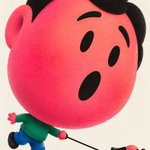
Graphic character poster, [RATIO], on neutral off-white paper.
One character with an enormous rounded hot-pink/coral head, about two-thirds of the figure, on a tiny compressed body: emerald top, short cobalt legs, stubby black shoes. Black compact hair, simple black brows, eyes and mouth, no white in the eyes.
Scene: [WHO + WHAT THEY'RE DOING], [EXPRESSION]. The head carries the emotion; the small body and any prop explain the story. Keep contacts clear: hands attached, nothing floating.
Text: "[CAPTION]" once, small bold black uppercase sans-serif in the paper space. No other words.
Print: fine, close low-contrast ink stipple inside the colored forms, soft coral-to-pink gradient on the face, soft airbrush at overlaps. Clean contours, no heavy shadows.
Never a small-head, long-leg cartoon.
VISUAL OS 095
Salvaged machines worn as fashion.
SKIN INTERFACE — a steel collar wired into her ear.
LOAD BEARING — a counterweight bolted to the hip.
PHANTOM LIMB — one leg swapped for a giant orange boot.
TORSION STUDY — a spine worn on the outside.
Prompt below ↓
🤖 Made with AI


Prompt ↓
Experimental fashion editorial poster, [RATIO], on pure white. No scene, no horizon.
One dominant model fused with heavy worn machinery: [MODEL + OUTFIT], with [MACHINE PART] attached to the [BODY AREA], changing the silhouette. Cold, self-possessed pose.
Painted realism, not a clean photo: broad scraped enamel, angular dry-brush planes in the black clothing, some unfinished edges. Signal-orange hardware chipped down to gray metal and muted olive. Face and anatomy stay believable.
Small solid-orange condensed headline "[HEADLINE]" in the white margin, plus "[LINE]" and a tiny code "[CODE]". Type stays smaller than the figure and never touches it. A few tiny orange registration marks.
No logos, weapons, neon, CGI gloss or city background.