

Indie cartoonist. Drawing traditionally. Inky fingers. ✝️ - Patreon: https://xitter.cf/t.co/0OulVNtkEt - Podcast: @BeautyComicPod
Tennessee
Joined March 2022
- Tweets5.2K
- Following986
- Followers986
- Likes6.1K




Pinned Tweet
I switched to Winsdor Newton size 3 brush. It's big but it's giving me the line weight I'm after.
I inked 90% of these pages with it and I think I'm going to keep leaning into the heavy lines.
What do you all think?


Drawing water this week.
Like trees and foliage, water is one of those things that's hard to get right in ink.
The goal of cartooning is to simplify something so it's an iconic representation of the real world analog. It should be simple and clear. The problem with water is that there's so many chaotic details that it's easy to memorialize too much information into the ink. It's hard to find the right balance.
I've struggled with this previously. My water was too chaotic and I really wanted to improve for this sequence. Fortunately Youtube has tons of videos of beaches so I just put those on while I inked and studied the patterns in the waves.
It's definitely not perfect but I'm pretty happy with the water in these pages. Especially the last panel.


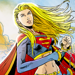
Here's a more modern colorized version that I also think works. If you have wide range of digital colors available to you, you can do more interesting stuff with light. The problem with the original color treatment is that they weren't making any strong decisions about where the light was coming from. So it just became a shapeless blob.
Adding consistent mid, shadows, and highlights with a clear light source really clarifies this image.

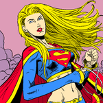
Here's an example of what I'm talking about. Just doing a quick redraw of the below and using a super limited color palette clarifies the panel and helps the main character stand out from the background.
It's certainly not great but it presents the relevant information simply and isn't just adding details for no reason.


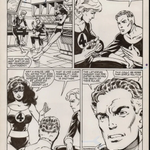
Interesting how strong that Kirby house style was at the time. Looks nothing like Byrne's later work.


Bryne is an interesting cartoonist. You don't often see him in a "Top 10 greats" list but I think his signature style is very effective and looks great no matter if he's drawing the Fantastic Four, X-Men or Superman.
He was unfortunately sandwiched between two very different eras of comics: The Cosmic Kirby Era and then the extreme Rob Liefeld / Jim Lee / Todd McFarlane 90s.
His style was transitional between those two poles and hard to latch onto. It was grounded and readable with realistic anatomy and clear storytelling. As a draftsman he was more consistent than Kirby and much more subtle than Lee or McFarlane.
But I think he lacked the panache of those two eras. You can't love or hate his work. Just respect it.


If you'd like to follow one westerner who's bucking this trend, I'm writing a fantasy comic for boys:
patreon.com/LeviNunnink/post…

This is worth thinking about more.


Painting had to go in a different direction with the invention of photography. Thomas Eakins used it extensively, but modernism responds in the opposite direction.
I would hope tgat the response to ai art and writing will be to understand true art and true thinking. Since art has its root in imitation, i have concluded that it must show the reader enough about how it’s done, so the reader can imitate the artist, can feel him drawing the lines and singing the words, just before they get sung.
A great deal of it will be done with the notion that ai is producing something totally new and locked in, so the reader doesn’t have to find his way in.
Lots of photography feels this way, a way that book illustration probably couldn’t achieve. Those readers were spared the effect of pictures so good that they shut your imagination out.
Cedric was kind enough to respond thoughtfully. Here's my response. (I'd love to keep this dialogue going with other AI-positive Christians.)
I keep hearing that statement from Christians: “AI is a tool”, which is true but also doesn’t address the issue, which is why I brought up the specific examples. Every new tool means that we will abandon an old tool. Every technology that our society adopts displaces a previous way of being.
The Camera is an interesting example so let’s stick with it: In the century from the widespread adoption of photography we’ve moved from a literary culture to a visual culture. Images, Cinema, TV, Streaming, and Social Media have occupied the place that literature and pulp previously held. It’s not that people are technically illiterate, it’s that they don’t want to read if they don’t have to and they certainly don’t get their ideas from what they read. Just a few examples:
- About 60% of 12th graders in the late 1970s read a book or magazine almost every day. By 2016, 16% did. (Monitoring the Future: Twenge, Martin & Spitzberg)
- About a third of 2016 seniors read no book for pleasure in the past year, e-books included. That’s nearly triple the 1970s rate. (Monitoring the Future: Twenge, Martin & Spitzberg)
Now we could debate if this was ultimately a good trade but it’s clear that one tool (The Camera) allowed the image to replace the word, creating axioms like “one image is worth a thousand words”. And this changed the way we communicate, process ideas, and even more importantly cut our links to the past where the word was king. A good example of this shift is how, in centuries past, social issue debates were fought with Bibles open. Now we use images and videos as our proof texts.
So back to AI. AI as a tool has huge potential for rapid displacement across a whole number of spaces where I think many of us assumed there was a “no robots allowed” sign. Even the name itself, “Intelligence” was something we reserved for beings with spirits previously. So what will we allow this tool to displace? Can an artificial womb displace a mother’s womb? Can a chat bot displace a conversation with a human? Can a LLM displace a sermon by a pastor? Can artificial intelligence truly displace human intelligence?
It’s a tool, yes. But it’s a tool that behaves like a human. Artists celebrating it are opening the door to a previously human-exclusive space. Basically saying, “Robots, Welcome”. Which then prompts my question: What other doors are opening? Where else are the robots welcome?

Fair question. I think you are essentially asking the Jurassic Park question: Just because we can do something, does it mean we should? Where does AI art fall on that spectrum?
Personally I see AI as a tool like a hammer. It can be used constructively to build a house, or destructively to bash someone's brains in. Or to nail a man to a cross. The problem isn't the tool, it's how and why it is used.
An analogy might be the camera. When it was first invented, the art world panicked. "Why would anyone hire us to paint portraits or landscapes when a machine now exists that will produce a perfect image with the push of a button?" But then artists do what they do best and got creative. They innovated and explored, asking "How can we express ourselves differently?" Soon we had Impressionism and Art Deco and Cubism and Graphic Design and Cartooning. New worlds of creative expression opened up because of the challenge of the camera. Today artists think nothing of using a camera for reference. You could even argue that the camera turned out to be one of the best things to ever happen to the art world.
A camera is a machine an artist can use to communicate creatively, a tool subservient to his vision. Or, it can be used badly to produce porn, take papparazzi photos, help social influencers scam people, etc. A camera can beautifully elevate our humanity or it can twist and denigrate it. Maybe I'm naive but I like to think of AI as a similar tool of expression, to be used for good or for ill.
AI is raising all sorts of practical and ethical challenges. I don't have all the answers. But I do reject a simplistic "AI is good" or "AI is evil" mentality. AI is a tool. What matters is how it is used.
Page 1 (Sept 2024) vs Page 117 (Oct 2026).
Stuff I've changed:
1. I start with Windsor Newton 3 for line work. I do *not* use nibs for line work (one of the biggest things I hate about my early pages). Nibs should be used sparingly for textures and mid-tones. I also don't use the Pentel Pocket Brush for my line work any more.
2. My pencils are done traditionally on cheap printer paper. No digital thumbnails or pencils. I used to pencil the pages in Procreate but the results looked stiff to me.
3. On the digital toolkit side, I do the word balloons in Adobe Illustrator instead of hand drawing them. This was a quick pivot.
4. Use a simple panel grid. Only break this grid in case of emergency. Early on I tried experimenting with breaking out of a strict grid and, man alive, I hate those pages.
The biggest thing I'm learning is that every mark on the page is information for the reader. Early on I would just fill up pages with textures because that's what it seemed like other artists did. But a lot of those pages look muddy and unclear to me now.
Now I try to be a lot more careful with the marks I put on the page. I think a lot more about "what information is this conveying" or "what idea is this trying to communicate".
xitter.cf/artbyhumans/status/211…


I started working on Open Your Eyes about 3 years ago. Just recently I revisited some of my early sketches and it's fascinating to see how much about how I draw has changed. I'm just getting to some of these scenes now that I sketched out in early concepts and they look very different.
It's what I hoped would happen if I committed to a drawing schedule but still it's interesting to mark the progress. Not that I'm where I want to be by any means but I'm getting closer to drawing how I want to draw, which feels good.
Still more work to do but it is heartening to mark the progress from time to time.


This panel kinda broke me. It seems to me to be the epitome of "timid" inking. I'm using nibs everywhere because I was nervous about nailing the smaller details with a brush. The end result is a panel that feels like it's entirely mid-tones. Way too much information and no clarity.
After drawing it I had a *never again* moment and rebuilt my inking process.
Just as a quick example, look how a quick digital redraw clarifies this panel by adding thicker line weight and removing some of the needless details.


This is a process and I'm still learning how to draw the way I want. Follow along on Patreon if you'd like to see more of the journey.
patreon.com/c/LeviNunnink
