
I solve website problems for business owners looking to increase their revenue without extra ad spend using psychological A/B testing & SEO
Web Developer
Joined August 2023
- Tweets2.6K
- Following75
- Followers228
- Likes19.4K





If you sell anything with a scent, your reviews are basically useless unless the reviewer says what they normally wear.
"Smells amazing" tells the next person nothing.
Everyone thinks their own perfume smells amazing, that's why they bought it.
"Similar to Baccarat but less sweet" sells the bottle immediately.
Scent is the one category where the customer genuinely can't evaluate the product before buying.
They can look at a jacket and know if it's their style.
With fragrance they're spending money on something they have no way of experiencing, so the only useful information is other people comparing it to things they already know.
And most stores never ask for that.
The review request says "how was your order," so people answer that question, and you get a wall of vague praise that all sounds the same.
Change the question and you get something completely different.
What do you normally wear?
What does this remind you of?
When do you actually reach for it?
Same goes for anything hard to judge remotely.
Fit, texture, taste, how heavy something feels.
Your reviews are doing the job your photos can't, but only if you ask the right thing upfront.
Something I've noticed watching session recordings: people hesitate right after they pick a variant.
Not before, not at checkout, right after they tap the size or the colour.
There's a small pause where nothing obvious is happening but you can see them not moving forward.
I think choosing forces them to confront the decision properly and up to that point they're browsing.
The moment they select something it becomes real, and whatever doubt was sitting in the background gets a chance to surface.
Wrong size, wrong shade, will this actually suit me.
Most stores put nothing in that gap.
You just pick a variant and the price updates, that's it but the doubt just sits there with nothing to push against.
What works is putting something useful right where the selection happens.
A line saying most people find this true to size.
A note that this colour is the one people reorder.
Something that answers the worry the choice just created.
It's an odd spot to optimise because the variant picker looks purely functional.
But it's where browsing stops and deciding starts, and there's usually nothing there to help.
Worth watching a few recordings and seeing if you spot the same pause.
"Free returns" is on almost every product page now, which means it's stopped doing much.
People read it the way they read a cookie banner at this point tbh.
It's just there, it's what stores say, and it doesn't really answer the thing they're actually worried about.
Because the worry usually isn't whether returns cost money.
It's whether returning something is going to be a hassle.
Printing a label, finding a box, queuing at a post office, chasing a refund that takes three weeks to show up.
So we've started testing swapping it for something that answers that instead.
"Free returns" → "Free returns, no printer needed"
Or "Free returns, refunded within 48 hours of it arriving back."
The first one tells you what it costs.
The second tells you what it's actually like, which is the bit people are quietly weighing up.
And that's the pattern with a lot of these standard trust lines.
They've been repeated so much they've turned into decoration.
The version that still works is the one that names the specific friction the customer is imagining, instead of the category the friction belongs to.
Same promise. Just answering the question they're actually asking.
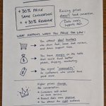
We turned off a client's free shipping threshold and just made shipping free on everything.
AOV dropped which was expected but revenue dropped too, which wasn't.
So I tried it on another store to be sure, surprise surprise, same thing lol.
But the funny part is what happened to order frequency.
Without a threshold, people bought less per order, but they didn't buy more often to make up for it so they just spent less overall.
My read is that the threshold was doing something beyond nudging cart size.
It gave people a reason to browse a second time before checking out, and that extra pass through the store is where a lot of the discovery was happening.
Take it away and people grab the one thing they came for and leave.
What worked better was keeping the threshold but making the progress toward it obvious in the cart, with an actual suggestion of what to add rather than just a number to hit.
So free shipping on everything sounds like the generous move, and customers probably say they'd prefer it.
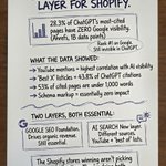
What I still think is crazy is that you can rank number one on Google for your ecom niche and still not exist to ChatGPT.
I've seen it enough times now that it just becomes the "usual thing" but I'm sure it will change again and again.
But right now they're doing two different jobs.
Google ranks your pages and AI decides whether it's confident enough to say your name out loud, which is a much higher bar.
And it gets there by seeing what the rest of the internet says about you.
Your Google profile, Reddit threads, listicles, review sites, YouTube, wherever your brand comes up.
If your own website is the only place that properly describes what you do, there's almost nothing for it to go on, so it picks whoever it can actually verify.
That's a strange thing to be losing on, because it has nothing to do with whether you're any good.
The gap between the two is only getting wider, and the businesses fixing it now are taking spots that'll be a lot harder to take in a year.
A lot of ecom SEO advice ignores the fact that your catalog is constantly changing.
You optimize a product page, build authority to it over months, and then the product gets discontinued.
Now what?
If nobody planned for that URL, all that SEO value can end up pointing at a dead end.
Google can keep sending traffic there for a while, users hit a “no longer available” page, and the problem happens slowly enough that most stores never connect the two.
The fix isn't complicated. It just has to be decided in advance.
Direct replacement? Redirect to it.
No replacement, but the category is still a genuinely relevant destination? Redirect there.
Coming back soon? Leave the page up with a notify option instead of killing it.
Ecom SEO isn't just about getting product pages to rank.
It's about having a plan for when those products inevitably disappear.
Most product page FAQs are wasted.
Shipping times, returns, how to wash it. Fine, but nobody's stuck on that.
By the time someone scrolls to your FAQ, they're interested, just not sold.
Something's nagging at them, and it's never "when will this arrive."
It's the quiet worry they'd never email about.
Will this work for someone like me.
What if it doesn't fit. Is it really different from the cheaper one. Am I gonna regret this next week?
That's what actually decides the sale, and most FAQs skip it.
The good ones read like the questions a solid salesperson hears all day.
"What if it doesn't work for my skin type?"
"How's this different from the cheap version?"
Every answer quietly kills a reason not to buy.
And being honest matters.
An FAQ that only hypes the product gets ignored.
One that's straight about the hesitation, even who it's not for, builds trust.
Most brands write their FAQ to save the support team some emails.
The ones that convert write it for the person hovering over the buy button, talking them past the thing they were too unsure to ask.
Don't just answer questions. Answer the doubts.
Most stores test two landing pages, pick a winner, and move on but the ones actually scaling run 10 to 15 at once.
With 2, you're not really finding the best one, you're just finding the less bad of two guesses you made yourself.
Run 15 against different angles, different hooks, different ways of framing the offer, and you stop guessing.
The market tells you what lands and it's usually an angle you'd never have bet on.
And these aren't button color tweaks.
One page leads with a problem, another with a result, another with a bold price.
Completely different arguments for buying, and the gap between best and worst is huge.
The catch is you need the traffic to run it properly.
But if the volume's there, testing wide instead of small is the fastest way to find the angle that actually moves the business.
Two variations is playing it safe. Fifteen is how you find the thing you'd never have guessed.
You probably think of your returning visitors as people who already know you but most stores show them the exact same thing they show a stranger.
Think about who's coming back.
Someone who saw your product, liked it enough to leave and think about it, then returned a second or third time.
That's def not cold traffic, that's someone quietly working up to buying.
But your store has no idea they've been here before.
Same page, same generic intro, like it's their first time.
You're re explaining things they got two visits ago instead of moving them forward.
The stores that convert well treat the second and third visit differently.
A first timer needs the basics: what this is, who it's for, why it matters.
Someone on their fourth visit doesn't need any of that.
They need a reason to stop deliberating, something that answers the one doubt holding them back.
Maybe that's a stronger guarantee up front, a review that hits their exact hesitation, or just a faster path to checkout.
None of this needs a rebuild, it's recognizing that not everyone's at the same stage, and treating a warm visitor like a cold one wastes the intent they already showed.
Your returning visitors are the closest thing you've got to a sure sale but most stores talk to them like they've never met.
Most subscription brands are losing money daily in places they've never even looked, and it's rarely the offer.
A few things I see all the time:
If subscribing is just a checkbox instead of the default, most people won't bother.
Make "Subscribe" the default and let people opt into a one time purchase instead, that change alone can lift your subscription rate.
A lot of brands blame cancellations on the product, when it's usually the onboarding.
People cancel because they never built the habit.
If your first emails aren't getting customers to use the product consistently, you're setting yourself up for churn.
Billing reminders are another missed opportunity.
Instead of a cold "you're about to be charged" email, send something like, "Your order ships in 3 days. Need to delay it?"
One click is a lot better than sending people straight to the cancellation page.
And stop judging everything by Order 2 retention. Order 3 is the milestone that usually tells you whether someone is sticking around long term.
None of this is groundbreaking tho..
It's just the small things that quietly add up while everyone's focused on launching the next product.
Half the stores I look at replatformed at some point and never checked their old URLs.
A chunk of their rankings quietly disappeared because of broken or missing redirects that nobody ever audited.
It usually happens after moving from WooCommerce to Shopify, rebuilding the site, or changing the URL structure.
The new store works perfectly, but the old URLs Google was ranking now return 404s instead of pointing to the new pages.
Over time, Google drops those pages from the index and the traffic disappears. Most store owners don't notice until months later.
The fix is pretty simple, find the old URLs, identify the broken ones, and 301 redirect each to the closest relevant page.
Before you spend time or money creating new content, make sure you're not leaking the rankings you've already earned.
A store owner told me last week he was killing his SEO budget because traffic dropped 40% this year.
He figured Google had broken search and there was no point anymore.
So I asked what his top pages were, all blog posts.
"What is ashwagandha," "benefits of collagen," "how much protein do you need."
Thousands of visits a month and almost no sales behind any of it.
For years that felt like winning because ofc the traffic number kept climbing, everyone assumed the SEO was working, and nobody looked too hard at whether it actually made money.
Well ofc it didn't, but the graph looked great so nobody worried.
Then AI summaries showed up and started answering all those questions right at the top of the page, so the clicks dried up.
The traffic that was never earning anything just vanished, and people took that to mean search was dead.
But nobody buys from an AI summary.
When someone's actually ready to spend, they search like a buyer, not a researcher.
"Best creatine for beginners," "collagen powder unflavored," "ashwagandha capsules."
Those still need a real store at the end of the click, and AI can't shortcut past that.
That traffic never went anywhere.
Most stores just aren't chasing it because they got hooked on blog visits that felt productive and never sold a thing.
So if your organic dropped this year, don't buy the "SEO is dead" line.
Go look at what you were actually ranking for.
Chances are you were winning traffic that was never going to buy, and ignoring the traffic that would.
Half the stores asking me to fix their conversion rate don't actually have a CRO problem. They have a "why would anyone buy this instead of the ten identical stores selling the same thing" problem.
And unfortunately, no amount of button testing fixes that.
You can move the CTA, add urgency, swap the hero image, run 57 A/B tests, and barely move the needle, because none of it touches the actual reason people aren't buying.
They landed on the page, felt like they'd seen it a hundred times before, and left to go compare prices somewhere else.
This is the part nobody wants to hear when they hire someone for CRO.
Sometimes the page is fine, the problem is there's no real reason to choose you over the next store selling the exact same product with the exact same stock photos and the exact same "premium quality" copy.
Think about the wooden watch niche, or phone cases, or minimalist jewelry.
A thousand stores that are visually interchangeable and when everything looks the same, price becomes the only thing left to compete on, and that's a race nobody wins.
CRO can squeeze more out of a store that already has a reason to exist. It can't manufacture that reason.
If a customer can't tell you apart from the competition in the first few seconds, the button color was never the issue.
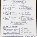
Before you optimize the page, get honest about whether the brand actually gives anyone a reason to pick it.
Get that right and the CRO stuff finally has something to work with.
Something worth trying on your product page is trying to show the delivery date, not the shipping speed.
3-5 business days is not always the simplest way of understanding for lots of people.
They have to figure out what today is, count forward, skip the weekend, and land on a rough guess.
Most people don't bother, so the shipping info just sits there as a vague "sometime next week" feeling.
"Arrives Thursday" does the work for them cause there's no counting, no guessing.
They can picture the box showing up, which quietly makes the whole thing feel more real and more worth buying now.
It matters more than it sounds because a lot of hesitation at checkout isn't about price, it's about "I'll deal with this later"
And later usually means never because they close the tab, get distracted, forget the product existed.
A specific date gives them a reason to go through with it now.
If ordering today means it's on the doorstep Thursday, waiting suddenly has a small cost attached to it.
Amazon trained everyone to expect this.
People are used to seeing exactly when something lands before they buy.
When your store just says "3-5 business days" it might feel vague and slow.
Same shipping speed either way, one of them the customer can actually picture, and that's the one that gets the sale.
I recently did a quick test by moving the reviews higher on a client's product page.
Most stores keep them near the bottom, under the description, the specs, the shipping info.
The thinking is that reviews are supporting information, so they belong after the "real" content.
But that assumes people read top to bottom.
They don't.
They scan, they jump around and a lot of them are looking for one specific thing before they'll even consider buying: has someone like me bought this and been happy with it?
If that proof is buried at the bottom, they have to scroll through everything else to find it and let's be real, some do but a lot don't.
They hit a wall of specs, lose the thread, and leave to go check a competitor whose reviews were easier to find.
So we moved a few of the strongest reviews up, right under the price.
Not all of them, and not the full widget.
Just three or four that did real work. The ones that mentioned a specific worry and then answered it.
"I was nervous it'd run small but it fit perfectly" That kind of thing.
The reviews that quietly handle the objection someone's already having in their head.
The idea is simple. By the time they reach the button, the doubt that would've made them hesitate is already dealt with, because someone they relate to dealt with it for them.
It won't fix a product people don't want, and it's not a reason to bury your actual product info. People still need the details.
But when your reviews are one of the strongest things you've got going for you, making people dig for them is just handing that advantage away for no reason.
Someone else is ranking for questions about your product.
Sizing, care, compatibility, whether it fits their situation.
That's your customer, on someone else's page, reading someone else's answer.
Go search a question a customer would ask before buying what you sell.
Not your brand name, something like "how do you wash merino wool" or "will a 15 inch laptop fit in a 20L backpack"
The results are almost never brands, they're blogs, forums, Reddit threads, affiliate sites.
People who don't sell the thing are answering the questions people ask right before they buy the thing.
Every one of those pages is a customer you had a shot at and never saw.
The fix isn't complicated, it's just unglamorous.
Take the questions your support team answers every week.
The ones in your reviews, the ones in your DMs.
Write a real page for each one, answer it properly, and link it to the products it applies to.
You'll rank because you actually know the answer better than a blogger guessing at it.
And the person who lands there is already halfway to buying, because they wouldn't be asking that question otherwise.
Most stores skip this because it feels like content marketing instead of selling.
It's the closest thing to selling there is.
The product page ranking above yours probably has worse photos and a higher price.
It just answered the buyer's actual question and yours read like a spec sheet.
Here's what most store owners miss about SEO.
You think you're competing on product quality, photos, or price.
Google isn't ranking any of that. It's ranking which page best answers what the person actually searched.
Someone types "wool sweater that doesn't itch" and your page says "100% merino, 400gsm, machine washable" which is technically accurate but it answers nothing.
The person wanted to know if it'll itch, and you made them guess.
The store ranking above you wrote a paragraph about exactly that.
Why their wool doesn't itch, who it's good for, what to expect.
Worse photos, higher price, but they answered the question.
So Google put them first and the customer trusted them enough to buy.
Spec sheets don't rank, answers do.
Go look at your top product pages right now.
Are they describing the product, or are they answering the questions a real buyer is actually asking before they'd feel safe spending money?
If it reads like a warehouse label, that's why you're on page two.
The fix isn't better photos or a lower price.
It's writing the page like you're answering a customer standing in front of you asking "but will this actually work for me?"
The number one thing killing your subscription program isn't the offer.
It's that people are scared they won't be able to get out.
They've all been burned before, a subscription that was easy to start and a nightmare to cancel.
With buttons that don't work, support that goes quiet.
Getting charged one more time while they're still trying to stop it.
So when they see "subscribe and save" on your store, part of their brain says "or I could just buy it once and not deal with it"
That fear kills more subscriptions than your price or your discount ever will.
The fix is showing them upfront how easy it is to leave.
"Pause anytime"
"Skip a month whenever"
"Cancel in two clicks, no email required"
Put it right next to the subscribe button, not buried in an FAQ.
When people know they can walk away without a fight, they're far more willing to start.
The easier you make leaving, the more of them stay.
Sounds backwards but it actually isn't. People commit when they don't feel trapped.
Most stores hide the cancel option hoping it traps people into staying but it just stops them from ever signing up.
A store I audited had 12% of visitors using search and those visitors converted 5x higher than everyone else.
The search bar was buried where almost nobody could find it on mobile.
This is one of the most common things I see and it's costing stores real money.
Someone using your search bar has already decided they want something.
They're not browsing, they're hunting and they know what they need and they're trying to find it fast.
That intent shows up in the numbers every single time.
And most stores hide the thing those people are looking for.
On desktop it's usually fine. On mobile it's tucked behind an icon, or collapsed, or requires a tap most people don't think to make.
So the highest intent visitor on your site hits friction immediately and either digs through collections or leaves.
Worth checking on your own store:
Is your search visible without tapping anything on mobile? It should be.
What are people actually typing? That data is sitting in your admin and almost nobody looks at it.
It tells you what customers want, what they can't find, and what you should probably be stocking.
What happens when search returns nothing?
Most stores show a dead end. That's a customer with high intent walking out the door.
Your search bar isn't a utility.
It's your highest converting entry point.
So you should really stop hiding it.
Your store's reviews are answering the wrong questions.
Customers leave "great product, fast shipping" but the buyer on the fence wants to know "did this work for someone with my exact problem" and nobody's asking reviewers the right questions.
Your review email says "how was your order?" So customers tell you how their order was, basic BS.
5 stars "Love it, arrived fast." Nice to have but does almost nothing for the next buyer.
Because the next buyer isn't wondering if your shipping is fast, they're wondering if it'll work for their situation.
Fit someone their size. Hold up to how they'd use it, be worth it for someone with their exact concern.
Generic reviews answer none of that.
So the on the fence buyer leaves to read reviews somewhere they trust more, or just doesn't buy.
The fix is the question imo, stop asking "how was your order?" Start asking:
What problem were you trying to solve when you bought this?
What almost stopped you from buying?
Who is this perfect for, and who isn't it for?
A review that says "I worried this would be too heavy for daily use, but I've carried it every day for 3 months and forgot that was ever a concern" closes more sales than 50 "great product" ratings.
Your reviews are one of your best sales tools.
Most stores collect the wrong ones by asking the wrong question.