

Brand + web for B2B software & AI founders. Founder @ByBrightStudios. 100+ clients. $1M+ on Contra. Clients: Bolt, Lovable, Contra & Magic Path.
Joined December 2012
- Tweets13.8K
- Following916
- Followers4.4K
- Likes46.4K





Pinned Tweet
Hi, I'm Daniel.
I run BrightStudios and design brand identity systems and build the websites to match. The throughline isn't industry It's the moment: companies at fundraise, launch, rebrand, or going upmarket.
My work spans across SaaS, consumer, hospitality, education, marketplace, and a few that don't fit a category.
Started designing at 18. Top 1% on Contra. Framer Partner, Webflow Partner most importantly a Barca fan.
A few names you might recognize: DAZN, Contra, Daydream, Hypernative, Marcura, Averi AI, SupaHumans.
I put together a reel of recent work, here it is:

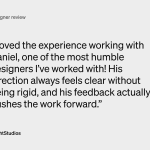
A designer I directed on a website design and Framer build, on how I give direction:
“His direction always feels clear without being rigid, and his feedback actually pushes the work forward.”

Before design starts, write down where your main call to action goes and which form handles it.
Then every page can point at the same next step.
At handover, check that the source files and assets actually landed on your side. And get short notes on where everything lives.
I've worked with 100+ career clients. Before you write a website brief, figure out where the site sits in your sales path. When do buyers see it? What should they do next? Roughly how many look at it before a first call?
Those answers decide what the site has to do.
The first draft of our free social media guide had everything. A pillars method, five layouts with rules, a calendar and a planning worksheet.
It made the work look like an afternoon's job.
So the version we published just covers the what and the why. It uses one real feed as the example and ends with a self-check that tells you where to start.
The layout rules and the template system stay with the engagement.

Martin left this on Contra after we finished Arteway's brand and site:
"Daniel went deep on who Arteway is and why we exist before designing anything. The result is a brand and website that feel editorial, warm and easy to use. A thoughtful designer and a great partner. Highly recommend!"
That first part is the whole job. You have to understand why the company exists before you touch a typeface.
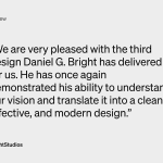
A recruitment company in Germany wanted a more premium website. Then came a second site and a landing page for the same team. They wrote:
“He has once again demonstrated his ability to understand our vision and translate it into a clean, effective, and modern design.”

Yesterday I had the chance to speak at the panel of the Contra Studios about where creative studios are going.
Had a lot of fun talking with @jameygannon, @thenickpattison and @theShaneLevine with @rongoldin moderating.
Thanks to the @contra team for bringing us together and to everyone who came out.

A warehouse robotics company needed new positioning, a new identity and a new website at the same time, across three products.
So we did all three together. The messaging, the identity and the page structure all hang off one product hierarchy.
When all of that needs work, I now scope it as one project. One fixed fee and one schedule, in writing, once the scope is clear.
Weighing a rebrand and a new site separately? Ask if they're really two projects.
The site had to work on day 300 the same way it did on day 1, with me out of the picture.
That was my own brief for an insurance tech company's website.
So we designed the handover around what their team does next. Adding new material, keeping product info current, reusing the layouts.
Plan the handover when you plan the pages.
I think two levels is right for a logo.
You get it on the first read. Then later you notice the second thing.
If it goes a level deeper, it's usually the designer being too clever. And then the team tends to stop using the logo.
Arguing about your homepage headline and it's come down to taste? Write the explanation first. The headline's easier to judge once that exists.
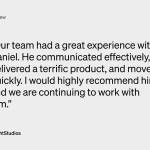
A moving and storage company in Miami needed a new website. We designed it, and then they came back for a dashboard design system. What they wrote:
“Our team had a great experience with Daniel. He communicated effectively, delivered a terrific product, and moved quickly.”

Before a design project starts, pick one approver. They gather everyone's comments and send them as one set.
Revisions stay focused and the timeline holds.
If someone on your team owns social every week and has time to build the system, you may not need an outside team.
If nobody does, that's the part to hand over.
This year we've done brand identities for companies in AI, pet health and car rental.
Before you ask a studio for a rebrand, write down the actual mismatch. Something like “enterprise buyers read us as a side project”. Then note where you've seen it, like lost deals or sales feedback.
A named mismatch is something a designer can scope.
Marigold° is a concept identity I made in one day for a design challenge. It's a summer general store that doesn't exist.
AI can make lots of images fast, but a brand needs a set that looks consistent.
So I started with real photography and kept picking until the direction was clear: low angle, one summer sky, warm accents on teal, faces turned away.
Then I generated images against that and cut anything that didn't match.
Pick your references before you generate anything.
