





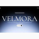
Michael • Product Designer • Framer Expert 🙍🏾♂️ retweeted
Founders, what are you building today?
Here’s a clean dashboard interface I designed earlier.
Simple to the core!


Michael • Product Designer • Framer Expert 🙍🏾♂️ retweeted
Old design vs New design
From a basic product landing page to a bold crypto and fintech experience with stronger hierarchy, tighter spacing, and real product presence.
Less decoration. More direction.
Less generic. More category defining.
Startup owners, this is what growth looks like.
If your product evolves but your design does not, you are already behind.


Founders, your product doesn’t suck because of the code.
It sucks because the UX is confused.
I designed this smart home app to be stupidly clear.
No clutter. No guessing. Just control.
Energy insights upfront.
Devices organized by room.
One tap actions. Zero friction.
If your users need a tutorial, you’ve already lost.
Design like revenue depends on it. Because it does.


Michael • Product Designer • Framer Expert 🙍🏾♂️ retweeted
Founders, your product doesn’t suck because of the code.
It sucks because the UX is confused.
I designed this smart home app to be stupidly clear.
No clutter. No guessing. Just control.
Energy insights upfront.
Devices organized by room.
One tap actions. Zero friction.
If your users need a tutorial, you’ve already lost.
Design like revenue depends on it. Because it does.
Michael • Product Designer • Framer Expert 🙍🏾♂️ retweeted
3D image generated on ChatGPT
Designed on Figma
Executed on Claude code with one single prompt
The world is evolving, we are fu*ked as designers if we can’t evolve with it too, no more flat a** design, no more wrong use of colors.
Simplicity is the new luxury.


Michael • Product Designer • Framer Expert 🙍🏾♂️ retweeted
Revenues. Orders. Trends. Risk.
If it’s not obvious at a glance, you’re flying blind.
Your startup moves at startup speed
Your dashboard should too.
No fluff. No noise. Just decisions.


Michael • Product Designer • Framer Expert 🙍🏾♂️ retweeted
I design the best dashboard on X
No one can tell me otherwise.


Michael • Product Designer • Framer Expert 🙍🏾♂️ retweeted
Rejected & approved hero section for a luxury brand
To be honest, I prefer the approved one myself too😅


Luxury is not loud. It’s intentional.
Just designed and built this experience on @framer . A high level executive retreat brand. Clean typography. Editorial layout. Refined imagery. Generous white space. Every section crafted to feel premium, calm, and exclusive.
Luxury in digital design is about restraint, clarity, and confidence.
Guess what? Client gave a huge tip on completion of the project.


Michael • Product Designer • Framer Expert 🙍🏾♂️ retweeted
Luxury is not loud. It’s intentional.
Just designed and built this experience on @framer . A high level executive retreat brand. Clean typography. Editorial layout. Refined imagery. Generous white space. Every section crafted to feel premium, calm, and exclusive.
Luxury in digital design is about restraint, clarity, and confidence.
Guess what? Client gave a huge tip on completion of the project.
Michael • Product Designer • Framer Expert 🙍🏾♂️ retweeted
AI automated interviews make zero sense to me.
You want creatives to sound authentic and human, but you remove the human from the process?
No conversation. No emotional feedback. Just you talking to a screen.
Removing humans from interviews and calling it “efficient” is lazy.
Michael • Product Designer • Framer Expert 🙍🏾♂️ retweeted
Dammnnn, @micro1_ai needs to hire me as their designer to get this kind of quality in their designs.
What do you say @aliniikk
Let’s book a call and talk about AI and interactions in design.
This is me shooting my shot👀

Clarity is one of the most underrated growth levers in product building.
And founders often realize this late.
You can have
• great tech
• smart features
• a solid team
• real users
…but if your product is not clear, people hesitate. And hesitation kills conversion.
When someone lands on your product page or opens your app for the first time, they are subconsciously asking three questions:
1️⃣ What is this?
2️⃣ Who is this for?
3️⃣ Why should I care right now?
If your product cannot answer these within a few seconds, you have already lost momentum.
For founders, clarity does a few powerful things:
✨ It reduces cognitive load
Users do not want to think. They want to understand. Clear products feel effortless to use and effortless to trust.
✨ It increases conversion
When people understand value quickly, they act faster. Clear messaging turns curiosity into decisions.
✨ It aligns your team
A clear product story makes it easier for designers, engineers, marketers, and sales to pull in the same direction.
✨ It builds trust
Clear products feel honest. And honest products feel safe.
One mistake I see often is founders trying to impress instead of explain.
Too many features on the homepage.
Too much jargon.
Too many animations fighting for attention.
Clarity is not about removing depth.
It is about revealing value in layers.
Say the most important thing first.
Earn the right to explain the rest later.
Design is not just how things look.
Design is how clearly things communicate.
If your users are confused, your product is not broken.
Your clarity is.
Founders who win long term obsess less about adding more and more about making things simpler, sharper, and easier to understand.
Clarity is not a nice to have.
It is a growth strategy 🚀
If you are building a product right now, ask yourself:
“Is my product clear to someone seeing it for the first time?”
That answer matters more than you think.
Michael • Product Designer • Framer Expert 🙍🏾♂️ retweeted
Founders working in the web3 space, hire me to design your product from start to finish!
- $3000/month
- Daily updates mon-fri
Send a dm and let’s get started.


Michael • Product Designer • Framer Expert 🙍🏾♂️ retweeted
Clarity is one of the most underrated growth levers in product building.
And founders often realize this late.
You can have
• great tech
• smart features
• a solid team
• real users
…but if your product is not clear, people hesitate. And hesitation kills conversion.
When someone lands on your product page or opens your app for the first time, they are subconsciously asking three questions:
1️⃣ What is this?
2️⃣ Who is this for?
3️⃣ Why should I care right now?
If your product cannot answer these within a few seconds, you have already lost momentum.
For founders, clarity does a few powerful things:
✨ It reduces cognitive load
Users do not want to think. They want to understand. Clear products feel effortless to use and effortless to trust.
✨ It increases conversion
When people understand value quickly, they act faster. Clear messaging turns curiosity into decisions.
✨ It aligns your team
A clear product story makes it easier for designers, engineers, marketers, and sales to pull in the same direction.
✨ It builds trust
Clear products feel honest. And honest products feel safe.
One mistake I see often is founders trying to impress instead of explain.
Too many features on the homepage.
Too much jargon.
Too many animations fighting for attention.
Clarity is not about removing depth.
It is about revealing value in layers.
Say the most important thing first.
Earn the right to explain the rest later.
Design is not just how things look.
Design is how clearly things communicate.
If your users are confused, your product is not broken.
Your clarity is.
Founders who win long term obsess less about adding more and more about making things simpler, sharper, and easier to understand.
Clarity is not a nice to have.
It is a growth strategy 🚀
If you are building a product right now, ask yourself:
“Is my product clear to someone seeing it for the first time?”
That answer matters more than you think.

Michael • Product Designer • Framer Expert 🙍🏾♂️ retweeted
Designed this using @framer
This is my first design on framer.

Michael • Product Designer • Framer Expert 🙍🏾♂️ retweeted
This was done on Figma for just $3500.
It’s crazy how a $3500 website can present your brand as a $500M enterprise

A company owner asked me yesterday to give my honest opinion on his website and here was what I could tell him 👇🏻
Founders obsess over how the brand looks instead of how clearly it explains the value.
If users don’t understand what you do in 5 seconds, your conversion rate drops. No amount of visual polish fixes that.
Clear messaging increases sign ups, retention, and revenue because people know exactly what problem you solve and why it matters.
Beauty is optional. Clarity is measurable.
Make your brand feel more like a partner and not a software.
Michael • Product Designer • Framer Expert 🙍🏾♂️ retweeted
A company owner asked me yesterday to give my honest opinion on his website and here was what I could tell him 👇🏻
Founders obsess over how the brand looks instead of how clearly it explains the value.
If users don’t understand what you do in 5 seconds, your conversion rate drops. No amount of visual polish fixes that.
Clear messaging increases sign ups, retention, and revenue because people know exactly what problem you solve and why it matters.
Beauty is optional. Clarity is measurable.
Make your brand feel more like a partner and not a software.

Michael • Product Designer • Framer Expert 🙍🏾♂️ retweeted
I’m not just a designer anymore
– I clarify messy ideas
– I reduce noise
– I design systems people actually understand
My job isn’t pixels.
It’s making things obvious.
The future belongs to clarity.