

Design Partner for SaaS & Consumer Apps II Website : https://teapaw.org/t.co/zI7WtN8Rrw
Melbourne, Australia
Joined November 2018
- Tweets43.5K
- Following771
- Followers2.2K
- Likes111K




A kiosk that only works if you're 5'10" is a liability.
We designed the MissPompadour POS for people of any height, then extended the same flow to mobile via QR Code so the handoff between screen and phone is instant.
One experience. Two surfaces. Zero friction.
That constraint is what made the design better.

Most product teams design screens, I design decision paths.
This is the full user journey mapped before UI refinement-every entry, branch, dependency, and outcome.
Why this matters:
You see where users hesitate, not just where they click
Business logic conflicts surface early
Edge cases stop being “future problems”
Activation moments become intentional, not accidental
A product isn’t a collection of features.
It’s a sequence of decisions that either compound clarity or compound friction.
If the journey isn’t architected, no amount of visual polish will fix drop-offs.

The Upgrade to Premium screen has been redesigned, transforming a simple pricing list into a smart decision center, with premium features, plan comparisons, billing options, support, and legal help—all in one place.

Focused on a hero-led landing page that creates a strong first impression through typography, spacing, and product presentation.

A dark, premium fantasy-sports interface built to help users track team performance, manage funds, and stay in control with ease.


Designed the sign-in flow to feel straightforward across desktop and mobile use cases. The layout supports quick access while keeping the entry point clean and consistent.

Before dev handoff, I map the entire app flow.
Every entry point.
Every state.
Every decision branch.
Not to make it look organized, but to expose friction.
Flow mapping reveals:
Dead ends that break activation
Redundant loops that slow task completion
Edge cases that engineering will otherwise “solve later”
Missing states that create churn moments
A clean UI can still hide a broken journey.
When the flow is clear, scope becomes precise, dev cycles shorten, and product logic holds under scale.


A bold, futuristic AI product concept that positions the assistant as a smart teammate through immersive visuals and strong hierarchy.

A sleek dark-mode energy monitoring interface designed to make usage, savings, and system performance easy to understand at a glance.


A kiosk that only works if you're 5'10" is a liability.
We designed the MissPompadour POS for people of any height, then extended the same flow to mobile via QR Code so the handoff between screen and phone is instant.
One experience. Two surfaces. Zero friction.
That constraint is what made the design better.

A detailed flow map that visualizes the full user journey and helps align design decisions, interactions, and developer handoff with clarity.

Not only visual focus, clearly showing value proposition of the platform with cosmic sky and messaging that ties into server status and new worlds.

A refined, immersive hero section that uses lighting, depth, and contrast to create a more cinematic brand presence.

Friendly home experience that makes booking laundry feel simple, fast, and service-focused from the very first screen.

This visual direction emphasizes mood and depth while keeping the core product visible in the foreground. It was designed to feel cinematic and modern, while still supporting usability.

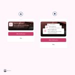
I created multiple component and layout variants to test structure, spacing, and visual priority. This helped identify the most consistent pattern for the final interface system. Which one would you select, and why?

This is where most retail UX falls apart, the moment a customer has to make a decision.
Choose your shade. Choose your finish. Pick the right product for your surface.
We designed this flow so it guides without overwhelming. Every screen reduces the decision, not expands it.
Fewer choices shown at the right time converts better than more choices shown all at once.
