

Lead Product Designer @polar_analytics
Paris, France
Joined February 2009
- Tweets1.6K
- Following557
- Followers493
- Likes992




Pinned Tweet
A lot of talk about AI for design is all about the *surface*. But how would AI behave if it was trained to navigate the deeper layers of design, so that it could help you, or help itself, when asked to work on a design project?
Made a skill pack for that: layers.jamiemill.com/

Love this discussion. Often comes up for me. Should our primitives be domain-specific or agnostic?
At Polar we added Labels, which could be used to model “is an approved metric” but it trades flexibility for affordance, eg we can’t yet say “show what Jamie approved”

Freedom within structure. Not freedom to make the structure meaningless
I'm here for anything other than LEGOs when we talk about products that supposed to do some work, not entertain.
I actually like the house analogy because it highlights there is a structure in place, and what kind of customization is actually meaningful or realistic, vs just turning things in to meaningless pieces.
A house has a structure and layout. In good houses, the layout follows the daily life well. Someone considered the experience from the door, to the kitchen to the dining spaces etc. Rooms have specific purposes. A kitchen is designed for cooking, a bathroom for bathroom, and a bedroom for sleeping. They have built-in features that make them useful for those purposes. These purposes help you to live your life in easy way without thinking each room as a custom arrangement of blocks.
Within that structure, you have freedom. You can choose the furniture, decorate, rearrange things, and decide how to use the space.
Now imagine a house shared by 1,000 people.
Do you really want everyone to decide for themselves what each room is for? Some people cooking in bathrooms, others sleeping in kitchens? And start customizing it towards their individual needs? Everyone having to figure out what everyone else means by a room?
So I think there is distinction of someone building a some crazy unique house and house that is essentially a place organizations to operate.
At Linear, we've deliberately designed shared concepts like issues, projects, and teams. Each has a purpose and consistent meaning across the organization.
There people have freedom in how set up their workspace or personal aspects of it, and what they put into these structures, and how they do their work. But they don't need to invent their own definition of a project or translate between hundreds of different definitions.
One of the key values of that structure is that it gives the work a canonical place. It’s rare to see someone casually duplicate an entire project in Linear. But people do this all the time with documents and spreadsheets, where making another copy is easy because the artifact is not actually connected to anything real. Over time, you end up with different versions and have to figure out which one reflects what’s actually happening.
The goal isn't to kill flexibility. It's to make the important decisions about shared structure so people can focus on their work instead of the system around it.
45
Fight human slop!

We will all be learning in coming weeks & months, that most human-made software:
▫️ Was really slow
▫️ Had many security vulnerabilities
▫️ Was under-specified and incorrect
AI will rewrite it all. Many times. It will make it fast, cost-efficient, and secure. It will think about failure modes we couldn't wrap our heads around.
It will prove, formally verify, load test, harden. It will turn memory-unsafe foundations into robust, optimized ones. If you ask, it'll thoroughly document it, teach you about it, make diagrams, animations, and slide decks.
In many ways, we are witnessing the true birth of software engineering.
25

Jamie Mill retweeted

To learn how to think like this, here's the source material (or at least what I can remember I've read that taught me to think like this about interfaces)
Good material for writing skills. I'll clean up mine and publish them here soon.

Little walkthrough of how I used Claude with @pendev and a one-off design jig to redesign our Polar homepage
2
5
171

Been fun adding more themes to @usefolius. Added some color roles, a new divider line sizing option, and a new fleuron. More in the works.

A bunch of beautiful new book themes just landed in Folius, plus more options to build your own themes too.


40

Seriously thinking of deleting our Figma design system, doubling down on Storybook as the system of record.
Then when I feel like using Figma just use the awesome “html to Figma” browser extension and throw the result away afterwards.
2
3
129

I can't be the only one that noticed that @bot eyes blink with a weird scale transform instead of proper animation? Looks like the eyes rotate into the head... lazy animation?
56
The building blocks are simple, but not easy: frontier models, robust data warehouse, self-building semantic layer, a good harness, and a full suite of tools.
And somehow the result is close to magic - surprising how it can handle the challenges our users have thrown at it.

Today we're introducing Polar Operator.
The AI operator built for commerce, working with your team in Slack.
It starts with the data and definitions your team already trusts - so it doesn't hallucinate.
We helped commerce teams trust their numbers. Operator puts that to work.
1
1
183
Sharing a little side project of mine: usefolius.com
A few years ago I needed to create some ebooks and didn't like the software I found, and it became a bit of an obsession.
Since then it's been a back-burner project, I've always been too ashamed of it to share...

1
3
117
I've put a lot into the typography engine, nerding out on stuff like this: teapaw.org/usefolius/status/20923…
Love or hate hanging punctuation?
You're covered, either way.

ALT A red line showing opening quotation marks are outset from the text, creating a cleaner left align on text.

ALT A red line showing periods and commas falling outside the hard right edge of justified text.

ALT Controls to enable/disable hanging opening and ending punctuation separately.
1
64
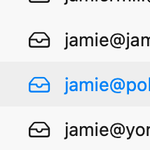
I really dislike that the selected mailbox in Apple Mail gets fainter than the others, it makes me think it's gone offline or something.
Seems to be the standard pattern in Tahoe - same in Finder and Apple Music - but here it's especially distracting.

1
1
108
