Design resources, textures, palettes & gradients. Articles, inspiration and tools for designers. ✉️ [email protected]

Joined January 2020
these distressed halftone textures make vintage posters feel authentically printed
these vintage halftone bursts instantly give posters retro comic energy
1
333
6
3,597
126,093
follow the light through these amber zigzags and violet folds
265
turn up the optical tension with neon moiré and pastel waves
1
14
615
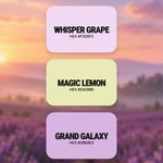
butter yellow and soft lilac make this palette feel like sunrise
2
11
471
NexGridCo retweeted
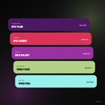
plum and cherry get an unexpected lift from sage and aqua
7
23
654
NexGridCo retweeted
warm up minimal layouts with kraft folds and aged paper textures
1
11
100
1,943
NexGridCo retweeted
bring the glow with molten red and muted champagne gradients
3
16
777
NexGridCo retweeted
lime teal violet and rose for designs that refuse to whisper
8
37
830
NexGridCo retweeted
peach spirals and orange ribbons give these gradients a warmer pulse
2
11
758
NexGridCo retweeted
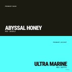
this bright cyan only needs one dark partner to stand out
7
44
896
NexGridCo retweeted
these thermal color gradients make your screen look like a heat map
2
17
904
NexGridCo retweeted
give clean layouts an analog pulse with amber and green scanlines
1
13
178
3,490
NexGridCo retweeted
a liquid spiral or sharp blue rays pick your kind of motion
14
763
NexGridCo retweeted
the violet trio that makes a single color family feel electric
8
46
948
NexGridCo retweeted
build a bolder backdrop with these distressed curves and color blocks
1
4
65
1,583
the creases and torn edges your digital collage is missing
1
2
69
1,336
plum and cherry get an unexpected lift from sage and aqua
7
23
654
warm up minimal layouts with kraft folds and aged paper textures
1
11
100
1,943