

The in-house CRO team you don't have to hire. Offers, pricing, funnels, LPs for 8-figure Shopify brands. A full senior pod for less than one in-house hire
8-figure Shopify brands only
Joined January 2021
- Tweets2K
- Following477
- Followers1.8K
- Likes5.6K





Two heads are better than one.
I offer free store teardowns - a fresh look on brand’s offer, funnel, messaging and design.
Deliverable: a nice report with all details needed for each test - just give it to dev/Claude and start testing.
DM with the store link to get started.
We saw a 21% increase in conversions in a test with zero changes.
We ran an A/A test for a jewelry brand: a test where both testing groups are identical.
If this had been a 21% decrease at this order volume (462), we would have stopped the test and called it a loser.
Assuming Intelligems is working correctly, that 21% lift was just noise.
Honestly, this was surprising in a bad way. Noise of that magnitude made us question a lot of past results.
That’s why we now follow strict rules for every test going forward: at least 1,000 orders per variation and run it for at least 7 days.

We raised the one-time purchase price on 2 subscription brands by $10 and by $5 to push more people to subscribe.
Conversion dropped 11% and 8.7%, and we didn't get more subscribers.
The idea was simple: a higher OTP price makes the subscription discount look more attractive next to it.
In the test, OTP orders per visitor dropped 34% and 21%. Subscribers per visitor came out +5% and -6%, both within noise.
RPV: -11% on the $10 increase, flat on the $5 one.
On the $10 test, a skincare brand, the share of subscription orders went from 62% to 71%. Here's the tricky part: share went up because OTP orders disappeared, not because subscriptions grew.
Honestly, I think people who wanted to subscribe would have subscribed anyway. What we actually did was punish the people who wanted to buy once.
So now we judge subscription tests by subscribers per visitor, not subscription share.
Next iterations: gifts only with subscription - don't punish OTP buyers with a higher price, show them what they lose instead.


We added an email popup for a board game brand. It captured about 4,400 emails in 9 days and still lost money.
The page targets an older audience, so we launched it with no popups at all.
But we wanted the list growth back, so we turned one on: three steps, a question, email, then phone opt-in.
We ran it as a live rollout on the page, not an A/B test.
We measured add-to-cart rate, not signups, because a popup will always capture emails. The question is what it costs.
Add-to-cart rate went down 8.8%, conversion rate down 5.4%. Roughly $4K in lost revenue over those 9 days.
Then we checked with the email team whether the list earned it back.
- About 3,200 signups after removing same-day buyers
- 102 of them bought within 7 days, about $4.5K
- Only 31 of those had any email or SMS touch before buying, about $1.3K
- The other 71 came back on their own
My take: the popup captured a lot of people, but the list didn't earn enough back to cover the drop.
Honestly, that might be a flows and campaigns problem more than a popup problem. No proper campaigns went out during the test, only flows.
We'll run it again in Q4 as a proper split test, when there's an actual calendar behind the gift-season emails.
We changed 3 lines of copy under the product title on a skincare PDP and saw +8% conversion rate in the test.
Control promised the outcome: smoother, brighter skin in four weeks.
The variant explained how it works instead: most retinol hits the skin all at once, which is why people quit by week two. This one releases slowly through the night.
That's the same messaging that most of winning ads had.
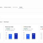
About the screenshot: we launched four variants. Three were flat or slightly below control in week one, so we switched them off.
That's why they look better than control here. Their bars are frozen at week one, when everything converted around 8% and there was noise in data.
My read is that "how it works" beats "what you'll get" when the ads already spent two minutes teaching the mechanism. Meaning that page should continue the ads story.

Most of what I post here is what we test on 8-figure Shopify stores and what actually happens.
A lot of these ideas came from just looking at the funnel.
I do free teardowns: I look at your funnel and send you the 5+ first things I'd test first and why.
If you run 8-fig brand, DM me your store - I can make a couple this week.
Charging $2.99 FOR shipping showed flat results for our client.
$123 AOV brand, free shipping on all orders. The product is positioned semi-premium, so we figured people wouldn't mind paying a small fee for shipping.
In the test: -1.33% conversions, and similar on RPV.
Honestly, we didn't go retest higher shipping prices. We took another route instead: adding a free shipping threshold.
One winning test in that direction so far, and we may still land on paid shipping overall later.
P.S. "Free shipping" is communicated prominently on the LP and PDP as part of the offer. So the test may have been measuring a broken promise as much as price sensitivity.
I didn't believe it at first, but headline testing worked for us in this test.
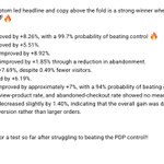
1-line copy change produced +8.26% increase in conversions.
Just because the headline of the PDP was more aligned with the ads and our audience.

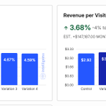
We made one line under the product title align with top spending ads and saw +3.7% revenue per visitor in the test.
The page is the main destination for a skincare brand's paid traffic. 100K+ visitors during the test.
The old line opened with a speed claim and a technical mechanism. But the ads sell something else entirely. You use it tonight, you wake up different, people notice.
So visitors clicked one promise and landed on another.
We tested 4 new lines:
- a specific occasion
- an alternative comparison
- a cultural authority angle
- the one that simply repeated the ad's promise as a scene you can picture
The simple one won:
+3.3% conversions
+3.7% RPV in the test
My takeaway: congruence isn't only about which page the traffic lands on. It goes down to the first sentence after the product title.
Our clever lines lost to the simple message that reflected ads message.

Our A/B test showed a listicle beating the PDP by 14% in conversions.
Reality turned out more complicated.
The brand spends a lot on TOF storytelling ads, all linked to a PDP with no storytelling.
So we built a listicle, split tested it and it won.
But I believe we should always verify such wins and see if the test results turn into real money.
With big swings like LP swaps or offer tests, the testing tool can't see what happens to ads performance.
So the test was step one. Step two was the media buyer launching the listicle as the real destination in duplicated ads.
At first it was rough - not even close to the evergreen ad -> PDP funnel.
After some time they scaled it to solid spend at similar ROAS. That was a good outcome, but not +14%.
My read on the gap: point ads at a new page and the traffic stops being the same traffic. Delivery re-optimizes around new post-click signals, learning resets, the audience mix shifts.
The split test gave us the direction and the ad account gave us the truth.
The listicle earned its place as a separate scalable funnel. A win, but quieter than the dashboard showed us.
Reordering the "reasons" on a listicle showed +5.4% more conversions in the test.
After 3 losing tests on this brand, we knew the audience is skeptical and needs time to be persuaded.
Their ads open on symptoms: inflammation, brain fog, gut. The listicle buried those at 5 and 6, with a salesy "save thousands" at #2.
We moved the symptom reasons up to 2-3 and the commercial ones down to 8-9.
Why I think it worked:
- The page now continues the ads' story
- Selling starts only after the reader is convinced
Very satisfying when a simple reorder proves the assumption right.

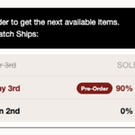
We also used this table for pre-orders.
Brand fully sold out, so pre-order became the only way to buy.
CVR dropped because people don't like paying today and waiting.
Adding the batch timeline won back 16% of that CVR.
My read: the table made pre-orders feel like "reserving" instead of waiting.

This table beat the classic "low stock" widget by a directional 18% in conversions.
Then it worked again on a second brand, placed under the ATC button.
Why we think it works:
- The sold-out batch is proof that people actually buy this
- "82% reserved" pushes you to act now, without a fake 5-minute countdown
- The next batch is 10+ days away, so waiting has a real cost. Some people just want it now
Honestly, those are just assumptions. But it worked twice.
Careful with fake scarcity though.
This only works if you truly sold out before and on track to sell out again.
How to move fast in CRO:
One person handles the entire process.
Research → Design → Copy → Dev → Test setup
How is that possible now:
Research & analysis: core CRO skills, nothing changes here.
Design: Claude designs on-brand elements and DR landing pages.
Copy: they know direct response principles, AI perfects the execution.
Dev: connect GitHub to your Shopify store, set guardrails to work in draft themes only, and vibe code directly in the theme. For Shopify apps: feed Claude the app’s tech docs so it knows how to modify them.
Test setup: give Claude your testing tool’s docs (Intelligems etc) and let it suggest the setup.
Why this matters:
Zero handoffs. No CRO → designer back and forth. No CRO → dev queue.
One person envisions the test and ships it themselves.
Devs and designers still add value, but they’re no longer in the critical path of every single test.
This is the next generation of CRO operators: one person owning the entire post-click journey.
It makes me a bit jealous when someone new joins one of our client accounts and finds an obvious test idea we missed.
It happens because nobody can stare at the same store for a year and still see it with the fresh eyes.
That's why I do free teardowns.
I walk through your store live and show you the most important tests I would run first, based on what has worked on our clients.
We analyze the LP, the offer, the full funnel.
If you're an 8-figure Shopify brand, check the link below
When clients are testing new angles or personas, we use this process to duplicate and rewrite winning LPs to match the message in ads.
This congruency is important.
E.g. sending new audience with headache symptoms to the old anxiety-oriented LP doesn’t make sense.
Getting AOV for one specific funnel in Shopify is a pain.
Here's how to get a clean AOV for one funnel, new customers only, based on real orders:
1. Open "Total sales by sales channel" in Shopify Analytics
2. Controls → add the Landing Page URL dimension
3. Filter "New or returning customer" → New
4. Set Attribution to the model you want
5. Find your funnel's LP in the Online Store sales channel summary
6. Net Sales ÷ Orders. Add Shipping Charges to sales first if your AOV should include shipping.
This is based on real Shopify orders, not analytics estimates.
We use it to be certain about a funnel's AOV before or after we test it.
Set your offer math off this number, not the store-wide blended AOV.
I've done 40+ interviews in 80 days hiring for a CRO strategist.
Insights if you're hiring a CRO person in-house:
1. Test task is a must
Give them real inputs: past research, LP performance, voice of customer, heatmaps. Ask for a few test ideas built on that data. Don't tell them what you've already tested - see if they land on your winners or find something you missed.
2. The feedback round tells you more than the task itself.
Send revision requests and watch how fast they reply, how they take it, whether changes actually get implemented and what questions they ask. This is exactly how they'll work after you hire them at best
3. Coachability beats brilliance
Ask: "Tell me about a time someone gave you critical feedback on your work." The scariest answer I heard: "I don't really get negative feedback."
5. "Tell me about a deadline you realized halfway through you couldn't meet. What did you do?"
Vague answer, or claims it never happened: red flag. What you want to hear: flagged it early, proposed a new plan, still delivered.
6. Ask general marketing questions, not just CRO. E.G: customer awareness levels. It exposes landing page skill instantly
7. Ask for losing tests. Watch whether they get more interesting or more defensive.
8. "A test you were confident in loses badly and the client is frustrated. What do you tell them?"
If they blame devs or "bad implementation" here, they'll blame your team the same way.
9. Ask to see real documented tests - gives you a clue about how organized they are
10. Ask exactly how they use AI and what they've built with it so far. There are "I use it for ideas" and "I built systems with it" levels to it
Last thing: budget 2-3 months for this. Great CRO people exist, but the ratio is brutal. We made 2 hires from 40+ conversations, and both took the full pipeline to find.
We fixed a broken button and lost 11% of revenue.
A brand we work with sells Buy 2 / Buy 3 / Buy 4 discounts.
The page showed them, but it had a basic - 1 + quantity selector.
Obvious fix right
Swap it to a proper Kaching selector and test.
It lost:
- Add to cart: -19.5%
- Conversion: -10.5%
- Revenue per visitor: -11.4%
Heatmaps and analytics explained why:
With the old selector, people spent 2x longer in the offer section.
The simple selector was accidentally holding them on the page long enough for it to sell them.
The new one was salesy and proved visitors' doubts - "they are just trying to sell me this" and went cold.
This audience is older and skeptical. They need that time.
Takeaway: for this brand's audience, time in the offer section converts
P.S. brand's category is health & wellness items
