Independent designer doing brand, web, and product design for startups. 🌻
Brazil
Joined August 2022
- Tweets184
- Following562
- Followers200
- Likes1.3K





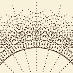


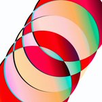
Brand design is more about tooling than ever. Not where you design, but the tools you create so the team can use the brand without stressing about how to use Figma or Canva. I'm seeing more and more companies following this route. Yes, we went full-circle into having internal tools again.
Arnaldo Petrazzini retweeted

Design based on best practices is not intentional Design, it is design based on best practices. There's an established recipe and a clear, logical path to follow. Most of the difficult decisions have already been made for you.
Best practices are just accumulated answers to shared problems from the past.
Intentional Design begins with questioning whether those answers apply to the problem you're trying to solve.
Intentional Design means every decision has a reason. A reason you specifically discovered and defined.
Sometimes that reason may lead you straight to established practices. That's ok. But sometimes it means you abandon them entirely. This is usually where something unique and exciting happens.
The important distinction is whether you made the decision consciously yourself or simply inherited it.
Some research suggestions for Newdle that I designed last year. Definitely too much for what it is, but I still love the green highlight:
Pieces from the work I did for Forerunner for their annual summit earlier this year, stoked to see it live.


Arnaldo Petrazzini retweeted
Dear Designers
Do not forget.
You're allowed to make something that doesn't lean on the same three UI component libraries everybody else uses.
You're allowed to use a typeface that isn't SF Pro.
You're allowed to make apps look and work differently, they don't all have to look like a Finder re-skin or a stock MacOS app.
You're allowed to question every single assumption and convention you have absorbed without noticing you absorbed it.
You're allowed to leave a fingerprint.
Do not forget,
you are a designer 🖤
The coolest thing for me as a designer right now is following my 4 yo daughter's writing journey, the way she thinks about letters when drawing them, the randomness of it (for us, simple-minded adults)
Yesterday I did a group mentorship session on visual design for componentes.design 🇧🇷, @willianmatiola project, and got a bit carried away on the slides, here are a few icons I did for it

Playing around with the idea of having an agent that helps you with your business finances. Bonus: A glass version just because


Arnaldo Petrazzini retweeted

From Metro Signs to TV Icons: The Architect Who Built São Paulo’s Identity.
João Carlos Cauduro, alongside his partner Ludovico Martino, revolutionised Brazilian visual identity in 1969 with the creation of the TV2 Cultura logo. Moving away from the era’s ornate and literal broadcast symbols, Cauduro applied a strict "Total Design" philosophy rooted in geometric precision and functionalism. The result was the iconic "bonequinho" (little doll), a minimalist silhouette of a human figure constructed from simple shapes. This figure was designed to humanise the medium, reflecting the station’s educational mission to put the viewer and culture at the centre of its programming.
The logo’s enduring power lies in its modularity and clarity. Because it was built on a rigorous grid, it remained legible across various media, from static print to early television animations. Beyond its technical excellence, Cauduro’s design became a symbol of modern São Paulo, helping to define the city’s aesthetic landscape. Decades later, the logo remains almost entirely unchanged, serving as a testament to Cauduro's vision of timeless, sustainable design.
#logodecks