

🏆 Award-winning agency with 13+ years of global design expertise 👉 Get your promo website. Start now: https://teapaw.org/t.co/hgT1B18roz 📩 [email protected]
New York, NY, USA
Joined February 2012
- Tweets19.7K
- Following667
- Followers1.8K
- Likes25.8K







Pinned Tweet
⫸ New @cssdesignawards banners and certificates, with a visual system inspired by flowers.
⫸ Read the case via the link in the comments – we break down how we made it and what the bright floral concept means.

⫸ A mascot can give a website composition an entry point before a reader reaches the copy.
⫸ Here, a hooded cat on a skateboard becomes the focal point against a soft blue field. Its recognizable silhouette, fur texture, and oversized expression keep the character readable at a glance.
⫸ Explore more work 👇


2
3
76
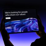
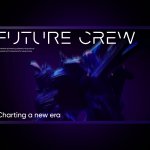
⫸ Recruitment pages don’t have to look like job boards.
⫸ For BrainShells, we created a one-page Webflow landing page for an AI-first team transforming online gaming. The page gives senior AI engineers a direct reason to look closer.
⫸ See the case 👇

Catch the link 👇
behance.net/gallery/23114904…

24
⫸ A racing game can look nostalgic without feeling slow.
⫸ For Sunday Drive, we paired pixel graphics and traffic chaos with browser-ready technology. The game began in Unity, then we rebuilt it with TypeScript and WebGL for web and mobile.
⫸ See the case 👇

⫸ Worldbuilding can start before a player reaches the gameplay.
⫸ For Starfall Arena, we brought the game's conflict between nature and technology into one split scene: greenery and plants on one side, dark space and science on the other.
⫸ See the case 👇


⫸ A production image rarely needs everything that was used to build it.
⫸ Our Docker setup keeps compilers, caches, and development tools in the build stages. The final stage receives the Python environment and application code – nothing that no longer has a job to do.
⫸ The image becomes smaller, easier to scan, and less exposed to unnecessary dependencies.
⫸ We explain the full setup in this article 👇
linkedin.com/pulse/docker-py…

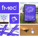
⫸ A brand for farm management software has to work beyond the product screen.
⫸ For FMEC, a pixel-based logo, high-contrast purple, and a robot mascot connect the software, advertising, merchandise, and field materials without making every application identical.
⫸ See the case 👇

2
6
140
Catch the link 👇
behance.net/gallery/18342324…
34


