

NYT bestselling Graphic Novel Artist/Writer • Marvel + DC Cover Artist • BG designer for animated feature "Robot Dreams" • Mr. X Co-Creator • Paul Rivoche
Toronto, Canada
Joined October 2009
- Tweets8.3K
- Following1.3K
- Followers1.5K
- Likes27.5K






ROCKETFICTION 🚀 retweeted

これはもう「絵がうまい」としかいいようがない。残酷なほどに「ただの才能」がここにあって、同じ状況を誰が描いてもこんな魅力的なレイアウトにならないだろう。急ごしらえのバリケードがあって、銃を持ってるハイハーバーの人々がいて、ラナがいる。背後に岩山が見える。そんだけ。多分絵描きなら誰でも「はいはい」と言って描ける。描けるが、決してこんな絵にはならないと確信を持って言える。彼の言う「つまんない空間」にしかならないだろう。逆に言えば宮崎駿はいかなるシーンでも「つまんなくない空間」として、しかも反射的に即座に描けたのだと思う。それは同じ平凡な被写体を前にしての、スマホを持った素人とプロのカメラマンの違いのようだ。


ROCKETFICTION 🚀 retweeted

'Speakeasy Corner.' (1928) Martin Lewis died in obscurity in 1962; he found some success in his early career, but was largely forgotten after the Great Depression leaving him to spend last three decades teaching etching including his famous pupil Edward Hopper.

ROCKETFICTION 🚀 retweeted

❝Critics used the word ‘illustrator’ as a denigrating label. I resented the implied barrier between illustrator and painter. Both should be measured by their competence—not by artificial compartments contrived by critics.❞
—N.C. Wyeth, born on this day, October 22, in 1882


ANIMATION SKETCHERY: another design exploration made for a 3D show. It was during the early phase of developing a series and was fun "blue sky" concept work, throwing out as many ideas as possible.
#conceptart #animation


GLAD SOMEONE SAID IT. All of nature is waiting out there to serve as raw inspiration, but too many times we get recycled copycat attempts at a 3D version of "Milt Kahl Face", watered down through many generations. Probably many of the younger artists have no idea where this came from, but poor Milt is probably rolling in his grave seeing how his work (and others from that earlier Disney school) have been turned into a stale formula.


4 examples of brilliant Milt Kahl art. It looks like his signature way of treating noses (in particular, but more than this) has somehow, through the years, been turned into a repetitive formula—a narrow bridge expanding to a bulbous tip which then further swoops along to a contrasting & sharply-accented nostril.
Of course, there are amazing exceptions, but I agree that this has now become a hallmark of lazy character design.


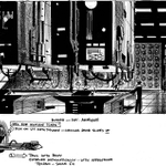
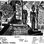
BATMAN BEYOND ROUGH DESIGN for storyboard: these were usually done from the script alone and made as an aid/starting point for the board artist. I'd first read the script carefully and make notes identifying the key elements of the scene, sub-locations, character movements, etc., then figure out how to design the space and the shot, all while establishing the right mood.
In addition, you'd have to consider the amount of room necessary (for example, often a "stage" clear area would be needed for a fight sequence with multiple characters) and what props the character(s) would interact with. In this example, I made a note for the board artist about how the morgue "slab" might work.
So making rough designs for a storyboard was a problem-solving, almost logistical challenge, as much as it was a drawing challenge.
Always considering the story was paramount because if the design was "cool" but didn't work for the story points necessary to get the scene or sequence across, then it would fail, and the design would have to be reworked.
So I'd try to get all of the important stuff in a drawing or drawings, as few as possible. If the actual design/angle could be used directly in the board, that was a time-saving bonus for production.
Not being completely locked down, a design of this type could be altered if the story required it, and often was, as the storyboard artist worked through all the staging challenges they'd encounter while putting the scene on paper. It was all a team effort getting to the end result.
