

End to end design studio for AI, SaaS & Web3 startups. Worked with @ycombinator, @AntlerGlobal & @a16z backed founders. ~ owned by @trywatermelonHQ
California, USA
Joined March 2026
- Tweets1.3K
- Following29
- Followers422
- Likes1.5K



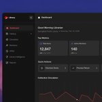
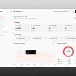
one number tells you how big the collection is. the split tells you what it actually is.
different questions, so they get different charts. print, digital, media, right beside the total.

kept the Enhance with AI button small on purpose.
its an assist, not the headline. once AI owns the toolbar people stop trusting the thing they just built.

we called it Library Intelligence. not AI, not Insights.
name the thing for the job it does, not the tech underneath it. nobody opens a screen because theres a model behind it haha

the mcp server did 2,252 connections in its first week.
180 on day one, 688 by day four. people are wiring the catalog straight into their editors.
mcp.watermelon.sh/mcp
mixing daily tools with configure-once settings is how things end up buried.
demostack keeps them apart. workspace on top, admin below. simple split, holds up well.

sending someone a dozen separate links is a mess. demo hub gives them one place to land and browse instead.
same content, much less work for the person receiving it.

the screen answers todays question. the export is for whoever upstairs wants a spreadsheet.
two jobs, and one screen shouldnt be trying to do both.

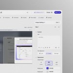
every demo step needs text, alignment, a style, a colour.
set all that in a modal and you lose your place every single time. so the panel sits beside the canvas instead.

the library sidebar collapses. sounds like nothing.
then you picture someone reading a wide table for eight hours straight and those pixels stop being nothing.

nobody opens a library system wanting features. they want answers.
wheres this book, whos overdue, whats missing. build the screen around the questions, not the modules.

catalog is what you have, circulation is what its doing right now. keeping those as two separate things in the nav is deliberate. mashing them together is how these tools get confusing lol

demostack keeps a Beta tag right next to Videos in the nav instead of hiding it. saying whats still cooking earns way more trust than pretending everything is already finished haha

the library dashboard opens with good morning librarian and the date. costs basically nothing to build, but a screen that treats you like a person reads so differently to one that just throws numbers at you

dark mode is never just flipping the colors haha. the red in these library charts had to come way down or it glows at you on black. contrast that reads fine on white gets aggressive fast. its a re-tune, not a switch

showcases vs demos is the demostack bit i keep chewing on. a demo is for you to build, a showcase is for whoever you send it to. totally different jobs lol, so we kept them apart instead of mashing them into one screen

two audiences in one library system is what made it hard honestly. the librarian wants speed, the member just wants to find a book. so OPAC stayed plain and the staff side got all the density. same data, two completely different moods

watermelon has an mcp server now. 334 things in the catalog, 189 blocks, 131 animated components, 11 dashboards, all queryable from your editor instead of copy pasted out of docs. mcp.watermelon.sh/mcp
a demo tool can do a LOT and thats exactly why the home screen has to stay calm, otherwise people just freeze lol. we kept the top to 3 moves, create a demo, run a tutorial, explore the gallery. you always know where to click first

bro the whole rule on this library dashboard was one line, if it doesnt help the librarian move faster it doesnt go on the screen. thats it. tools get bloated cause everything feels important, but the useful move is almost always cutting

