

Brand + web for B2B software & AI founders. 100+ clients. $1M+ on Contra. Founded by @danielgbright Clients: Bolt, Lovable, Contra & Magic Path.
Available for work
Joined December 2024
- Tweets522
- Following82
- Followers225
- Likes541






A car rental platform in Greece needed messaging that could earn mainstream trust. Its reviews already had the answer. People described the service by what it took away, from deposits to bureaucracy. In Greek that's «χωρίς»: “without.”

A studio that helps AI companies get one product story out already had its positioning. It needed an identity to match. Before handoff we tested it on real pieces: posters, social layouts at small sizes, and a website hero.

A UK farming network's brand audit found inconsistent type and assets. And the guidelines had to work with no designer around. So the icons come with a construction grid. Every new icon starts from it, and the set stays consistent.

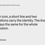
A focus app's identity had to hold up on a screen the platform mostly controls. It's the shield you see when you open a blocked app. There's room for an icon, a short line and two buttons. We kept that line the same for the whole session.

An AI talent platform was moving past traditional staffing. Its brand had to explain the AI part and still keep people at the center. So we did the strategy and the identity together, from positioning to the wordmark.

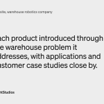
A warehouse robotics company was growing from one product into a bigger portfolio. Buyers needed to see where each one fits. So on the site we designed, every product starts with the warehouse problem it's for. Case studies sit right next to it.

The landing page for an online MBA alternative had twelve sections, all about the same weight. We cut it to ten and simplified the type. Now it reads in the order a buyer actually decides.

An AI marketing platform covers everything from content strategy to analytics. That's hard to explain in one view. So on the site we designed and built, the homepage just introduces the workflow. The product pages carry the detail.

An enterprise maritime tech company had announced its rebrand launch. The website we designed had to be ready for it. It also had to fit six product brands and an acquired company into one structure.

A focus app that moves real money had to show people where that money goes. Sometimes a donation is logged but hasn't reached the charity yet. So in the app we designed, that moment gets its own screen: “Still owed.”

We named and branded a brand-intelligence startup. After handoff, their team still had to keep making brand calls without us. So we put the decisions in a kit they could keep using. Figma libraries, assets and notes, plus voice rules.

An agency helping education companies grow enrollment needed its own site redesigned. They wrote:
“From initial discussions to final delivery, he understood our vision perfectly. Super patient with our endless feedback and revisions, always professional and enthusiastic.”

A UK farming network wanted farmers to feel like celebrities. So that became our test. Would a farmer actually want this on their own post? The voice runs on four values: Honest, Useful, Funny and Theirs.

From our Lab: a brand exploration for an ambient intelligence product that works quietly in the background. Soft sky photography, a muted palette that runs from dusty blue and sage to a deep brown, and headlines like “Everything, in balance.”

An AI governance company needed four website pages on a tight timeline, and one diagram on them was arguing against the product. From their review on Contra:
“Daniel asked all the right questions when defining project scope.”

A pre-launch focus app ties people's focus to saving, donating or a fitness goal. With stakes like that, its founder needed every choice to read clearly.
So the three paths carry equal weight and nothing is preselected. The check mark only appears once someone picks one.

A client who has worked with us on several branding projects:
“Daniel brought a calm, professional approach to every stage of the process, making communication easy and productive.”

The identity we designed for a Nordic AI shopping assistant had an extra job: carrying the company through a change of name. Logo, typography, color and iconography were built for that move, and the same rules carried across the English-first website and the launch materials.

